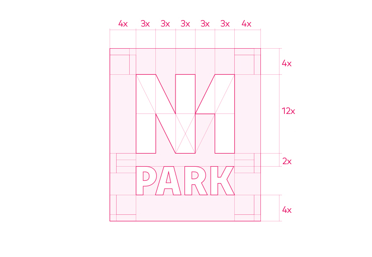
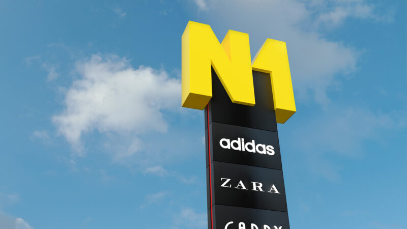
Stacja Nowa Gdynia
2022
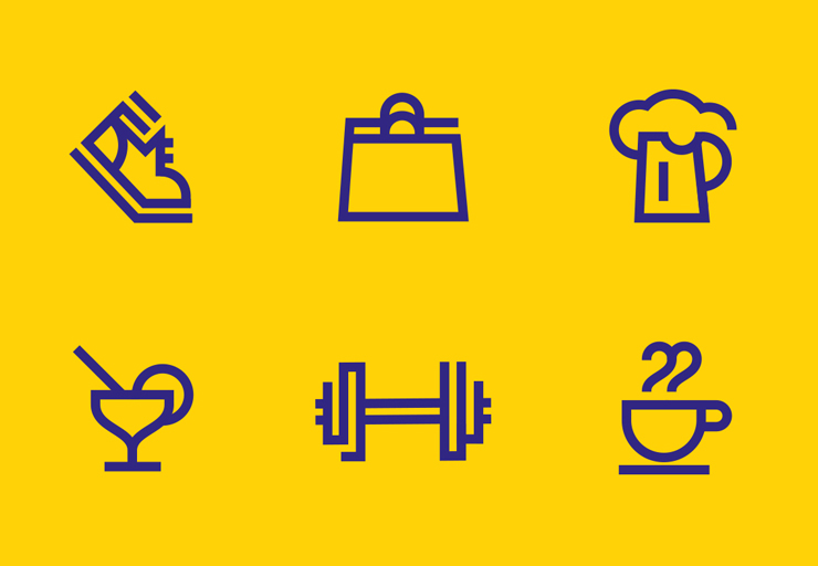
- Recreation
- Brand consulting
- Brand architecture
- Illustration
- Visual identity
- Interactive
- Wayfinding
- Brand guidelines
For more than 15 years we have been helping Polish and international companies, develop their brands. Take a look at a selection of our realisations.
Brand image of a company operating on the foreign markets, which is a part of the Pelion Healthcare Group. We have developed a brand name and visual identity elements for the new activity. The trademark is based on dedicated lettering.
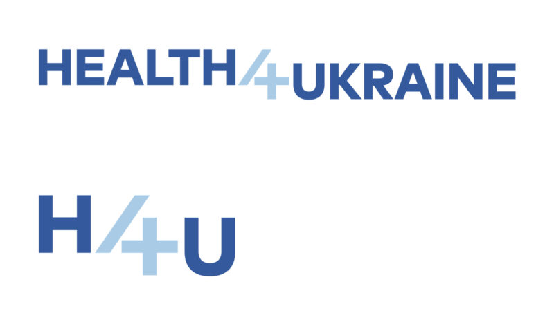
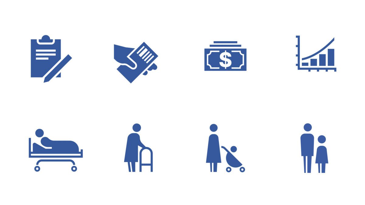
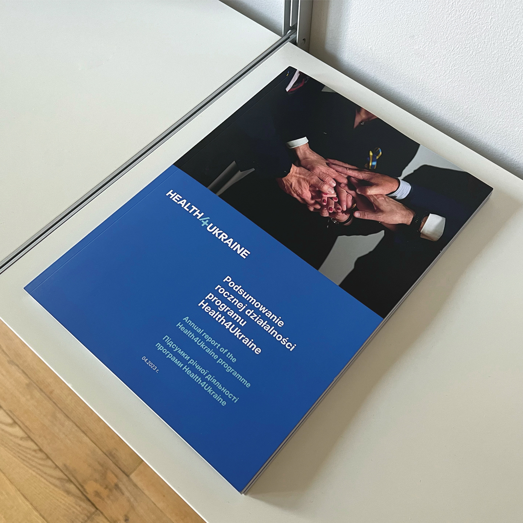
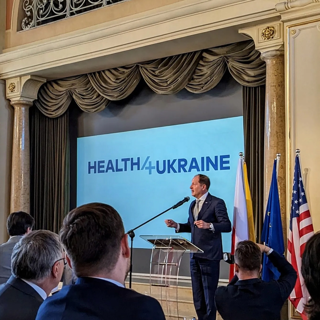
The H4U programme makes it possible for Ukrainian citizens who were forced to leave their homeland due to Russian aggression to receive funding to purchase medicines in pharmacies across Poland.
The implementation of the Health4Ukraine programme, carried out by the Polish fin-tech epruf s.a., was made possible thanks to funds provided by donors such as the US Direct Relief organisation, which donated $15,000,000 for this purpose. Our task was to develop a clear, simple and consistent communication, easy to use in different media.
The “trzeci sektor” Quarterly is an interdisciplinary academic journal that aims to provide practitioners, researchers, experts and policymakers with the latest knowledge on the state and prospects of civil society development in Poland and around the world. The journal also serves as a forum for discussion and exchange of views on these topics. Our task was to redesign the magazine’s logotype so that the dedicated lettering would fit in with FAOO’s brand architecture.
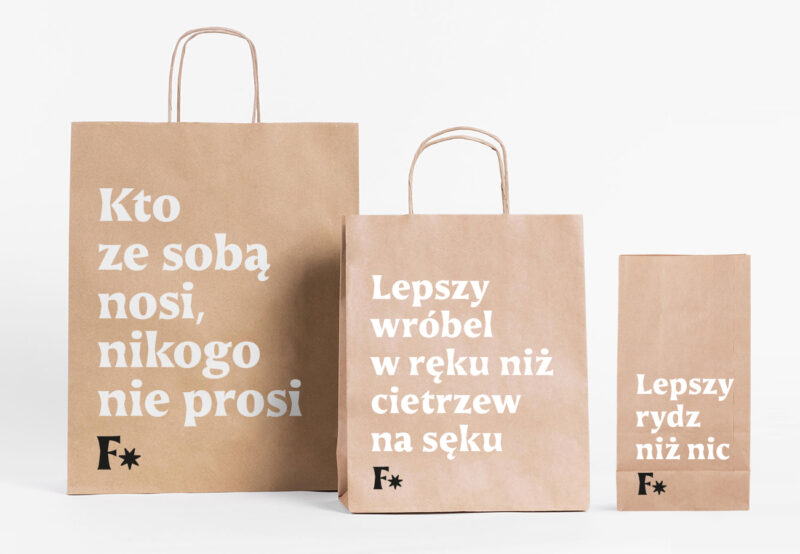
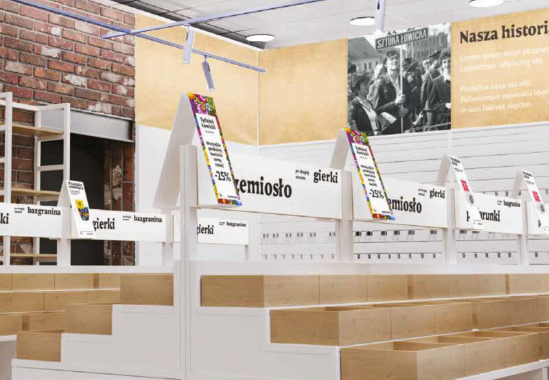
Folkstar is a Polish chain of shops with products inspired by folk motifs. The company proves that folk culture is alive and well, bringing folklore back into favour and giving it a modern twist. Recording folk designs is not possible, so the customer was faced with constant imitation. The aim of the project was to develop a visual system that would translate into greater brand recognition. The client wanted the audience to see the value above all in the fact that the ‘Łowickie flowers’ on the product are from Folkstar, meanwhile he was under the impression that he was simply advertising the design itself.
Our task was to conduct an audit and workshop with the client, through which we developed a new brand strategy and architecture. The process culminated in the development of guidelines for a new visual identity system. Typography became the main element of the image, referring in form to hand-cut folk ornaments. Based on our initial recommendations, the client developed the design independently.
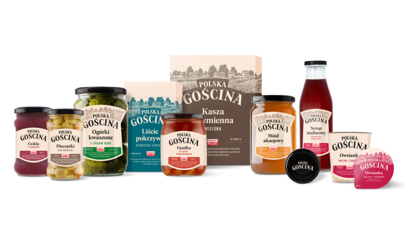
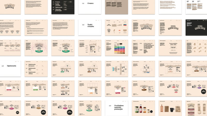
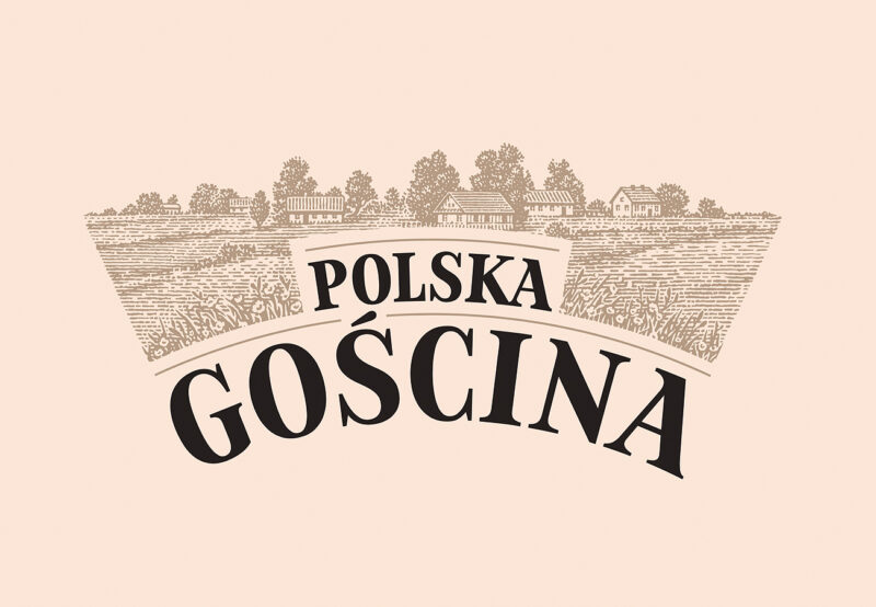
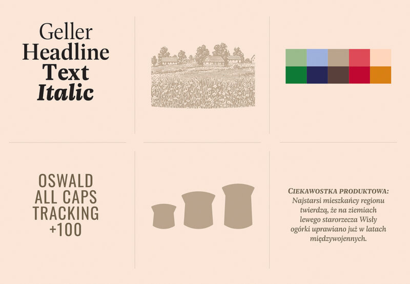
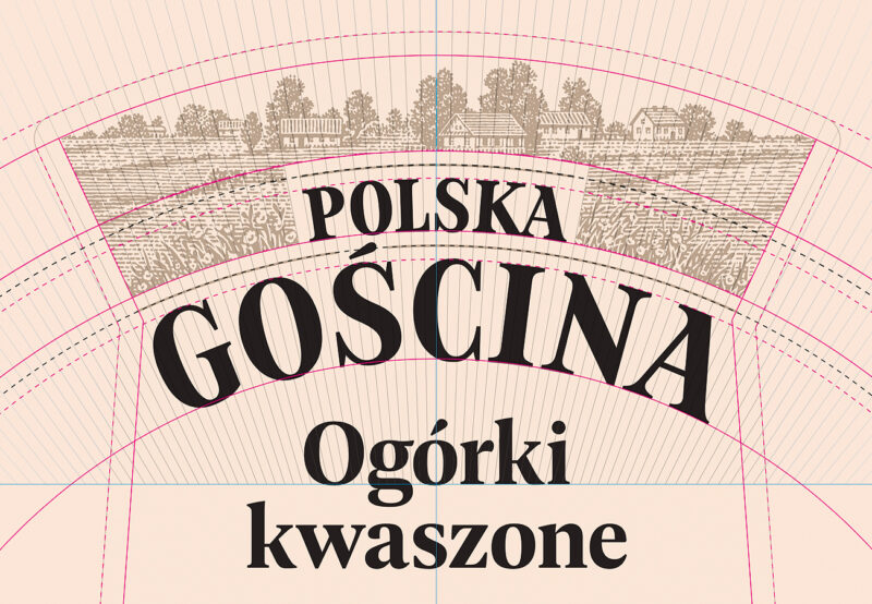
Polska Gościna is a line of products classic Polish dishes available in Carrefour shops. The brand addresses its offer to all those who appreciate the quality offered by local producers and are guided by their simple composition when choosing food items. Brand offers original products made according to old recipes handed down from generation to generation.
Our work included developing a brand name, defining the basic principles of the brand strategy and the entire visual system. In the brand manual, we described in detail how to develop the packaging line on the basis of a description of 26 SKUs containing cardboard, flexo and glass packaging. The implementation of the identity is handled by the client’s internal department.
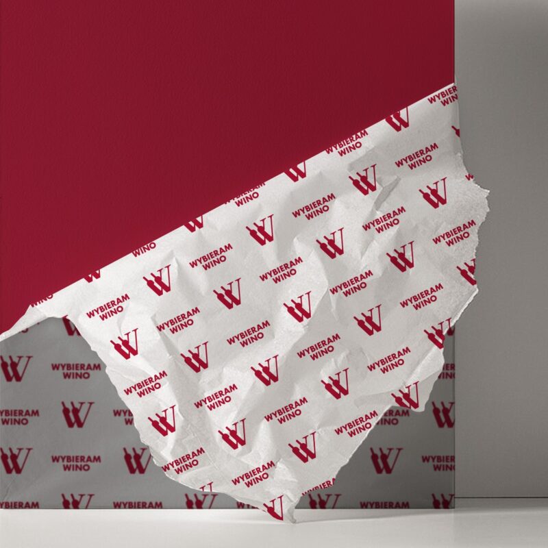
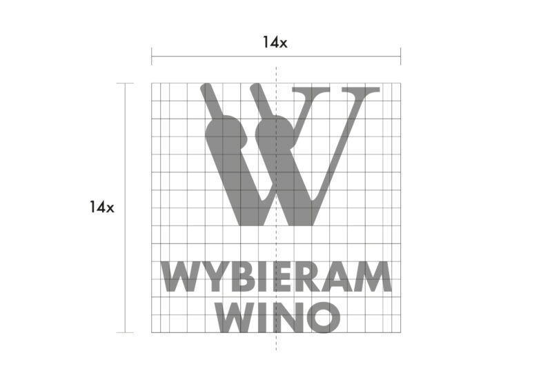
Wybieramwino.pl is a shop featuring the best types of wines from different regions of the world, from Polish wines to wines from Israel and Chile. The brand belongs to the JNT Group, one of the largest producers, importers and distributors of wine in Poland. As part of the project for the new business branch, we developed a logo design along with a brand book.
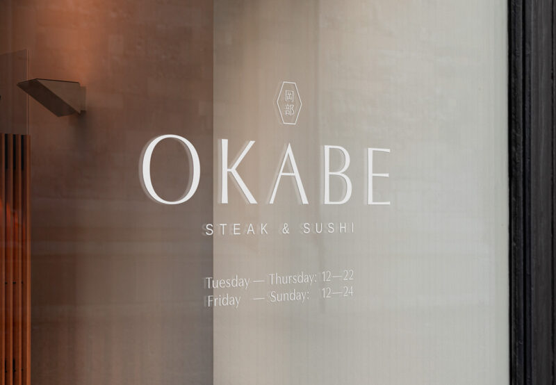
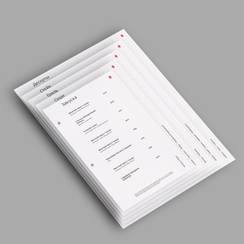
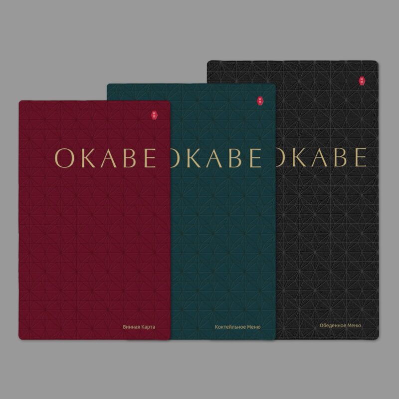
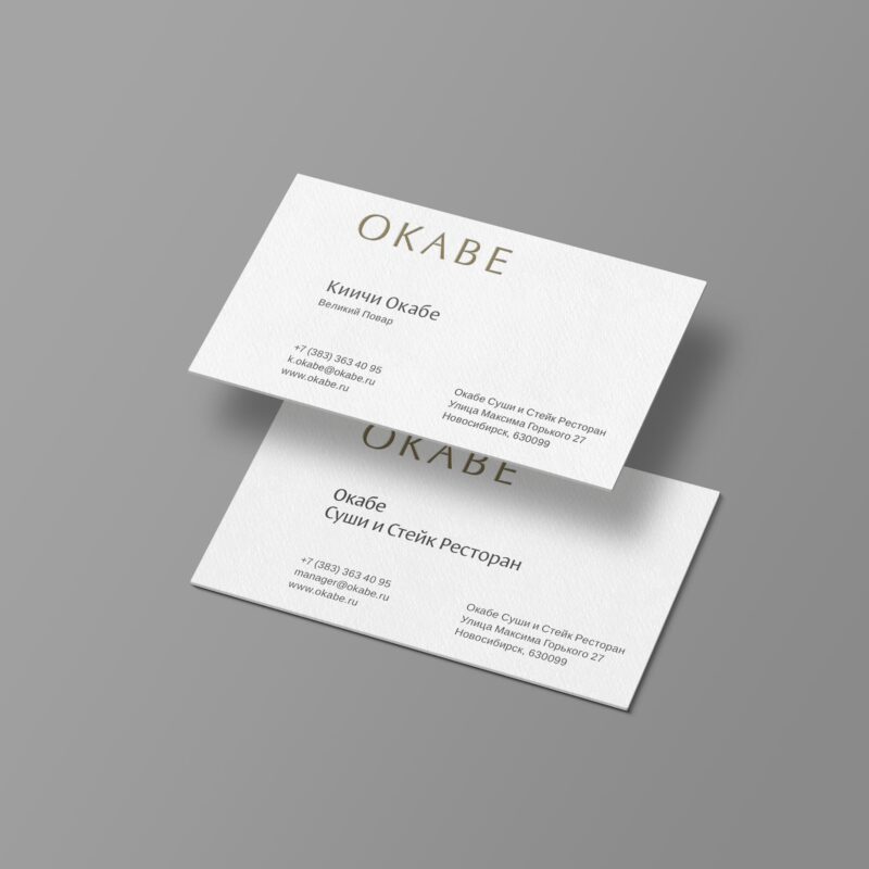
Visual identity for a sushi restaurant in Novosibirsk. The chef is master Kiichi Okabe, who combines Japanese flavours with fresh local produce from Siberia, Baikal Lake and the Far East. Okabe Restaurant is the perfect combination of aesthetics, comfort and luxury, which we have reflected in the visual identity.
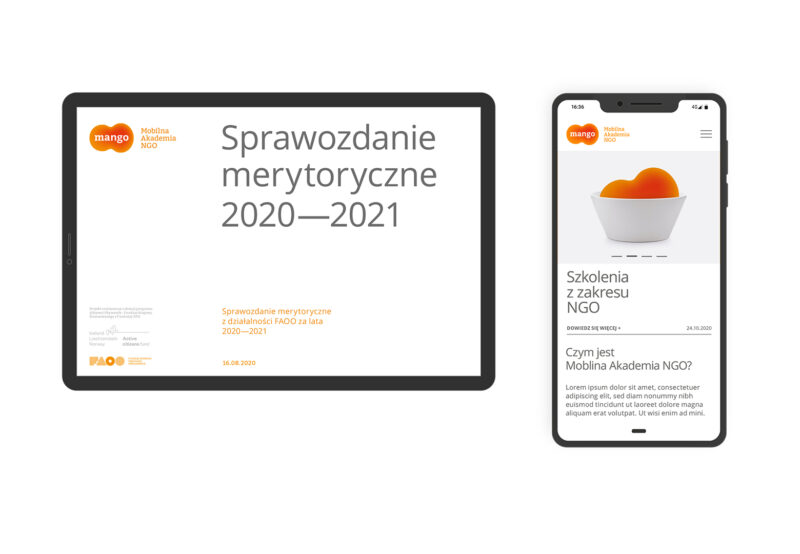
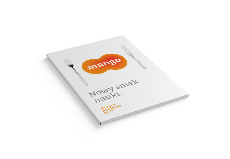
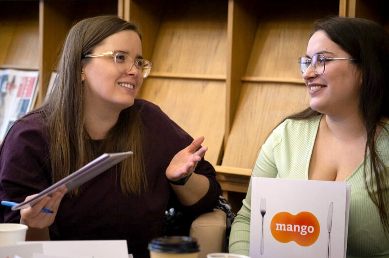
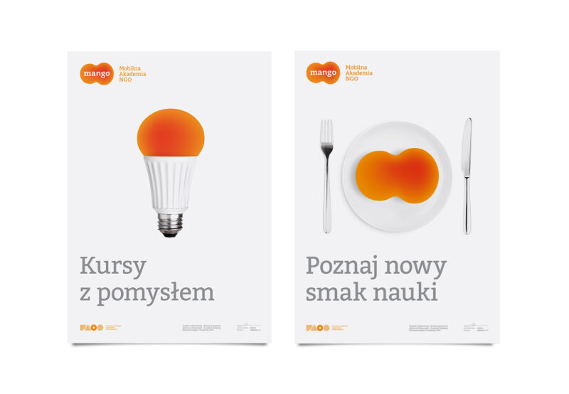
MANGO is a Mobile NGO Academy created to reduce barriers to education for people outside of large geographical centres. The overall aim of the project is to strengthen the potential of organisations and civic initiatives operating in smaller towns.
We developed a visual style for MANGO, as well as a communication language.
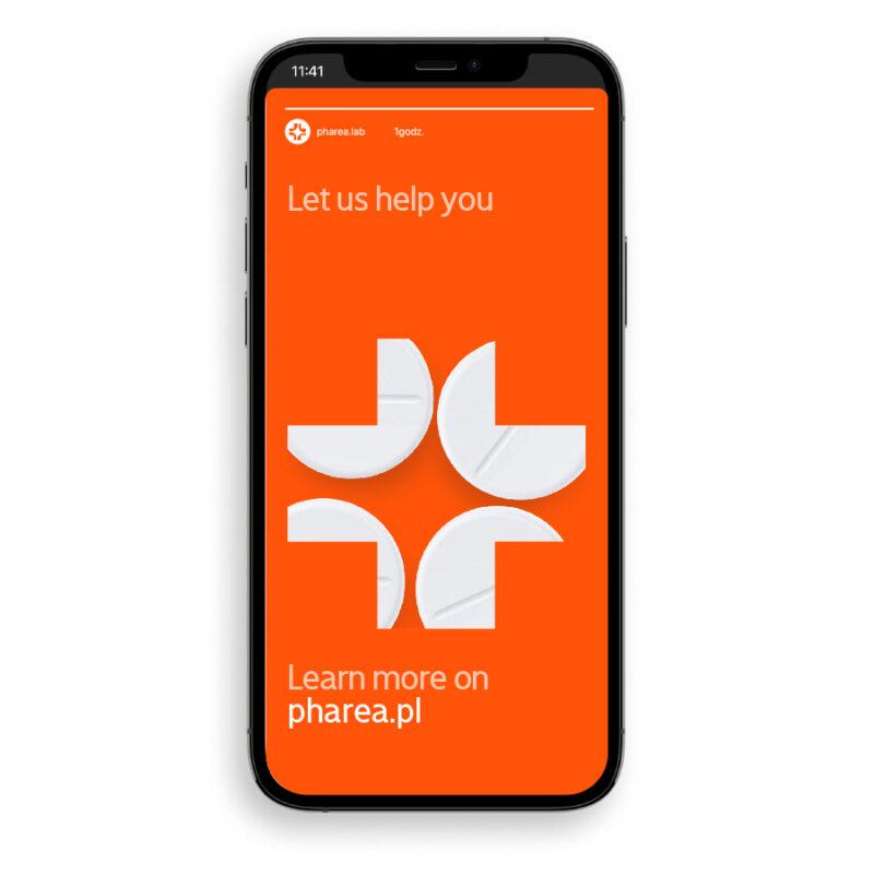
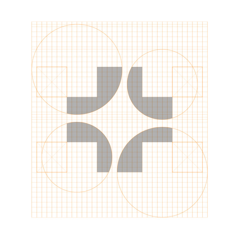
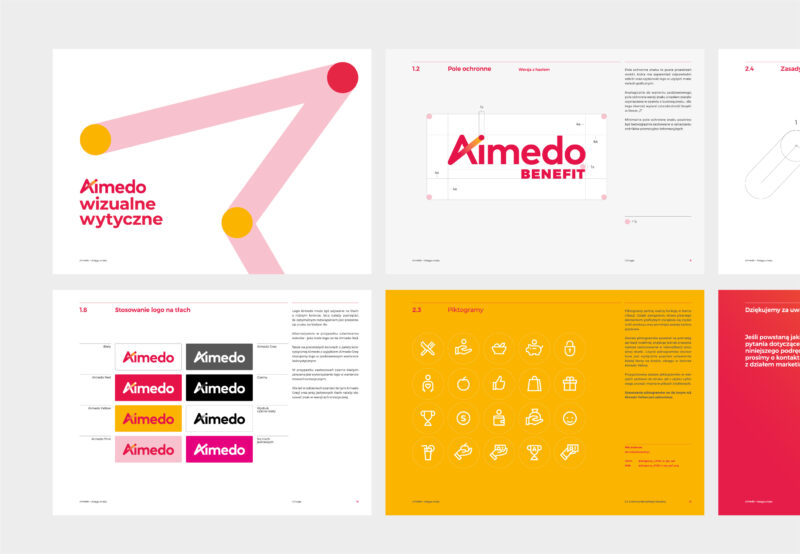
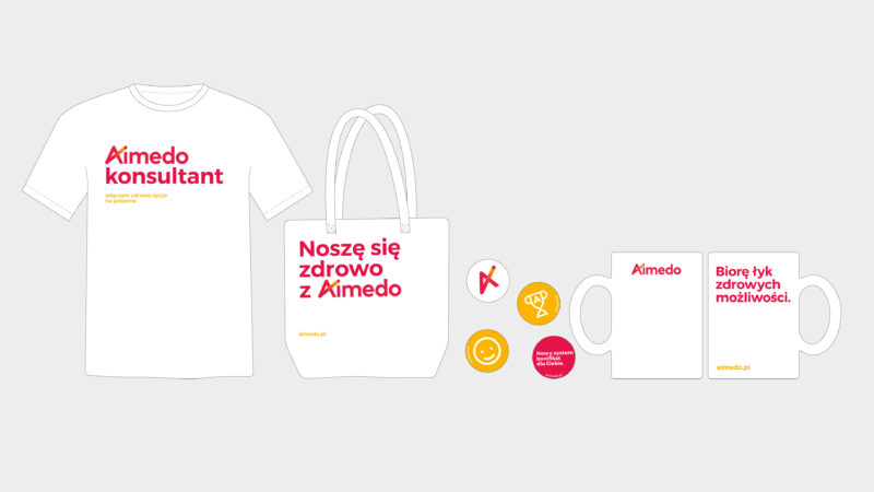
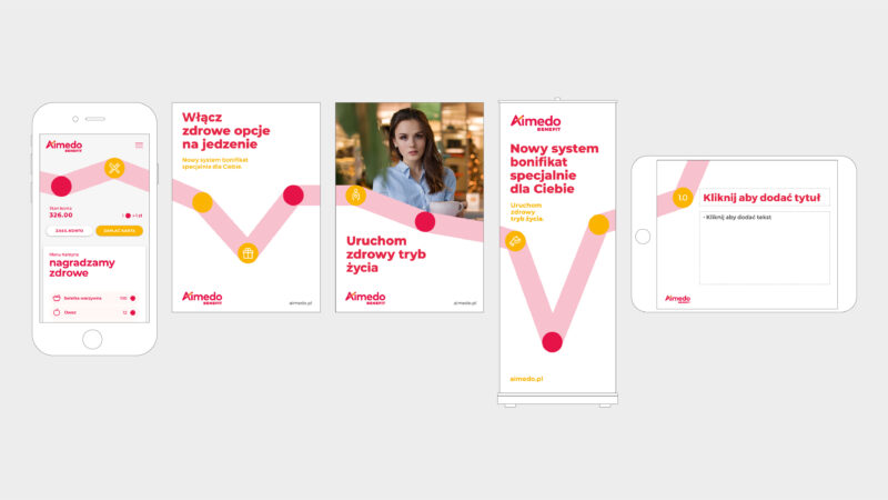
Aimedo benefit is an app owned by Pelion Healthcare Group. It is intended to support the employees in healthy eating and habits. Our task was to develop the project’s key visual, communication theme, logo design and visual identity rules.
A brand of the highest quality veterinary products on the Polish market, whose image we developed for Max & Mrau, part of the Pelion Healthcare Group.
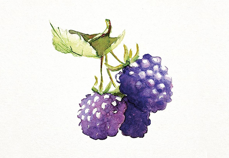
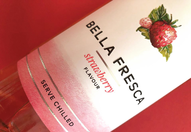
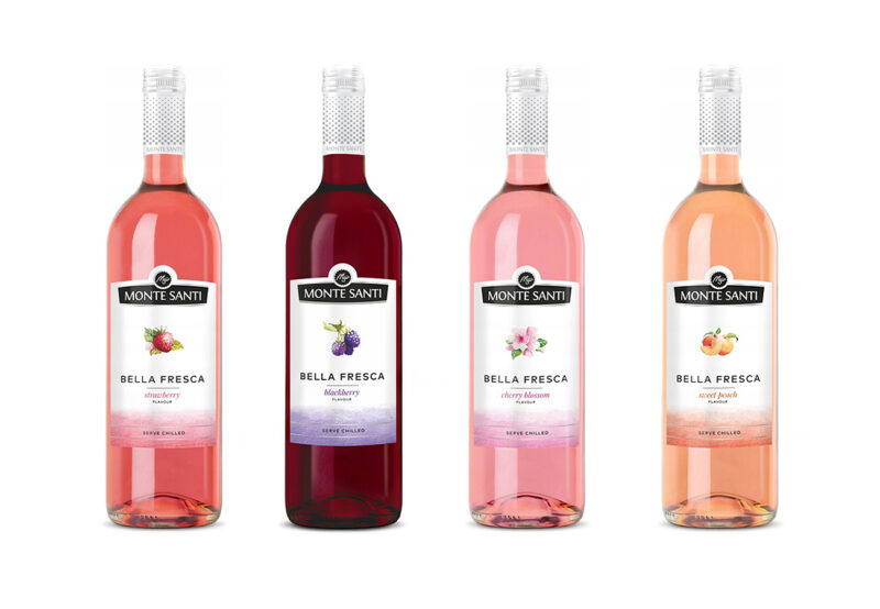
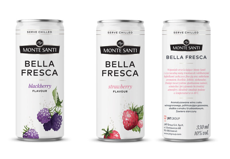
Our task was to develop a packaging concept for the BELLA FRESCA line, a Monte Santi brand. Watercolour illustrations relating to the taste of each wine became the main identification element of the series. The line was further expanded with a new format – 330 ml cans. The brand’s gestor is JNT Group, one of the largest producers, importers and distributors of wine in Poland.
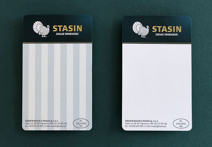
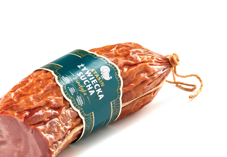
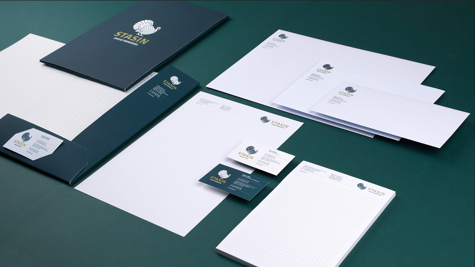
The poultry plant, located in the Mazowieckie Voivodship, is one of the largest and fastest-growing companies in the industry.
The basis for the rebranding was the brand’s distinctive turkey image, which, combined with distinctive colours and typography, conveys the high quality of the products on offer. We adapted the refreshed logo to various forms of implementation. The use of predominant green and gold in all graphic materials ensures their consistency across the company’s wide range of products, while also differentiating them from the competition.
References
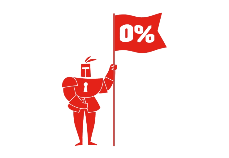
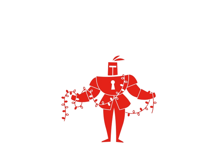
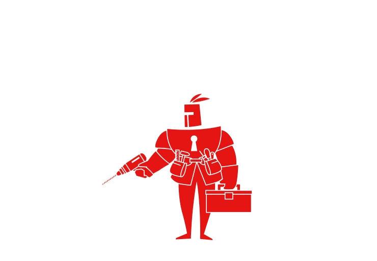
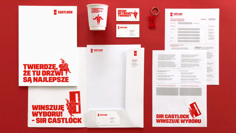
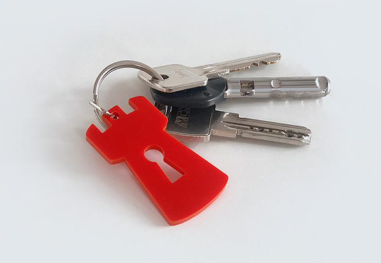
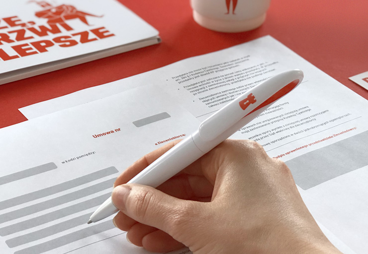
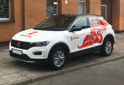
A company with many years of experience, it offers customers sales, installation and expert advice in the selection of internal, external and entrance doors. Castlock provides the customer with comprehensive care from the first visit to the showroom to the installation of doors selected from the company’s extensive range.
The design of the visual identity is based on the symbolism of a fortress, which a house with a well-chosen door can become. The characteristic figure of the knight Sir Castlock became the main element of the brand world we created. The brand hero enters into a friendly dialogue with the customer and, combined with the expressive language of the brand, emphasises its solid and trustworthy character.
References
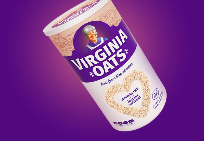
A brand of instant oatmeal producer, promoting healthy eating and emphasising cereal products and their rich nutritional value.
When working on the brand logo and product packaging, we opted for a classic illustrative style, associated with naturalness, tradition and a taste “like grandma’s”. We focused on emphasising the nutritional qualities of the instant meal, thereby eliminating negative associations with unhealthy, quick snacks.
References
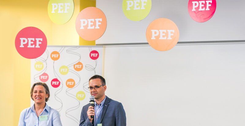
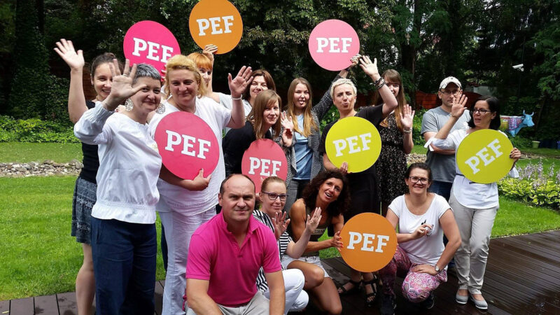
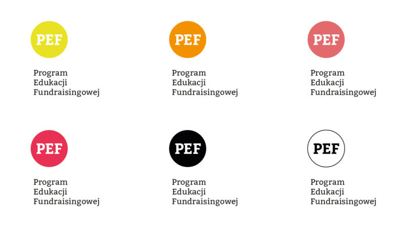
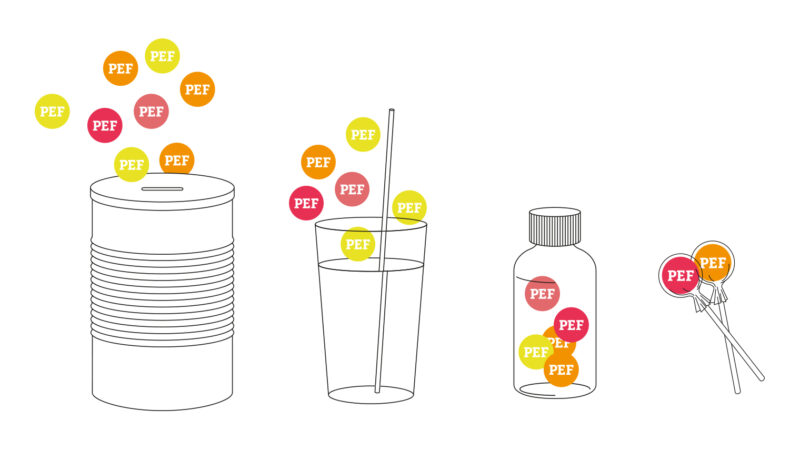
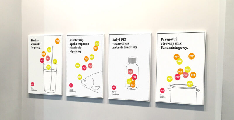
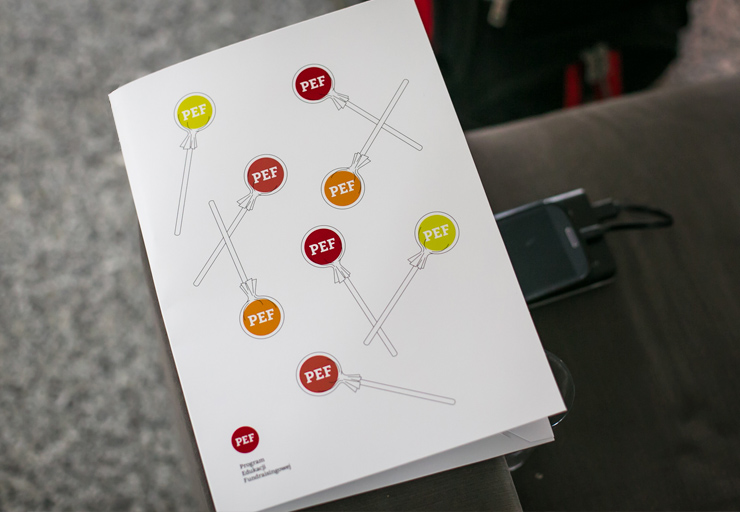
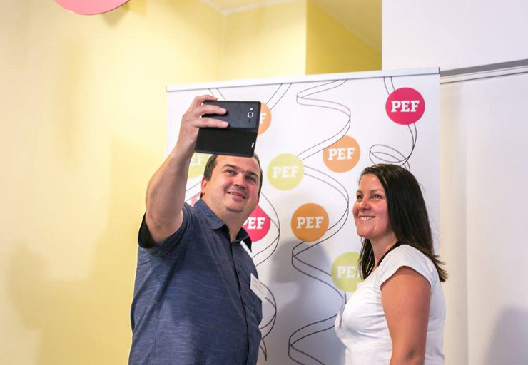
An educational proposal from the Academy of Civic Organisations Foundation, dedicated to those interested in the topic of fundraising. As part of the Fundraising FAOO offers NGO managers a free course to explore and improve fundraising processes.
PEF’s branding reflects the idea of fundraising by multiplying the main element – the logo in several colour versions. By using limited means of expression in the form of linear graphics and catchy advertising slogans, we focus attention on the name and purpose of the programme.
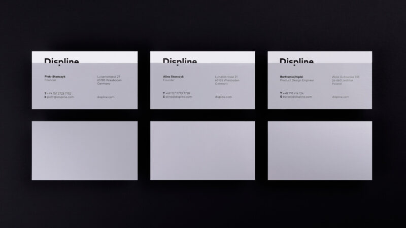
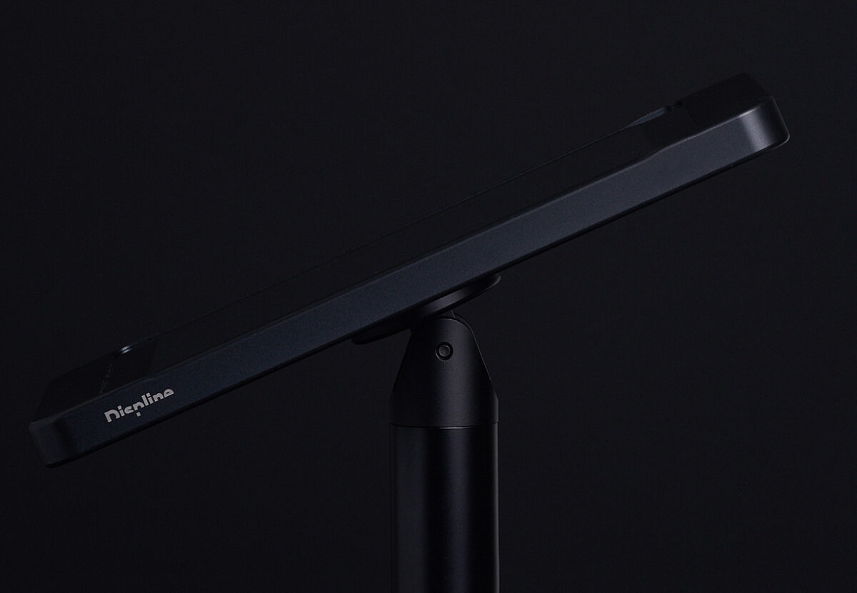
A startup dedicated to the production of aluminium tablet stands, combining elegance with the highest quality of CNC manufacturing. The name is a combination of two words: dipsplay (to display e.g. on a screen) and line (range, collection, line), which refer directly to the heart of the range – aluminium products.
The idea behind the design of the brand mark was to already convey the character and values of the company through the logo. To metaphorically reflect what its product range actually is. Therefore, the logo is half invisible, as if cut in half (CNC). At the same time, it is readable – just as the stand remains a background for content viewed on tablets and fits neutrally into the aesthetics of virtually any interior (shops, offices, public spaces).
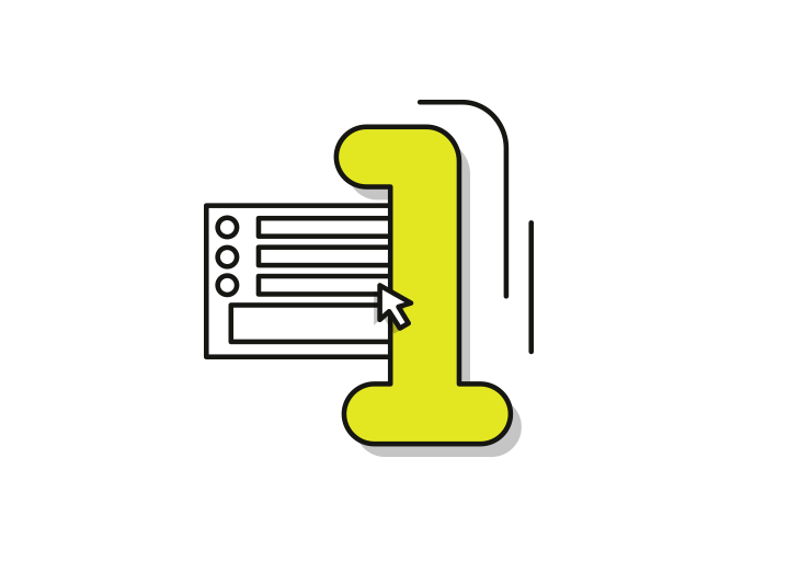
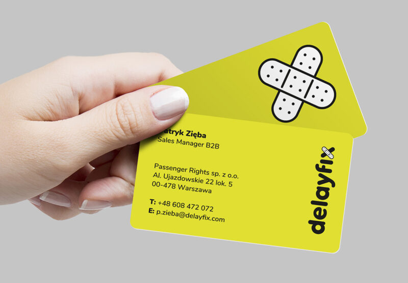
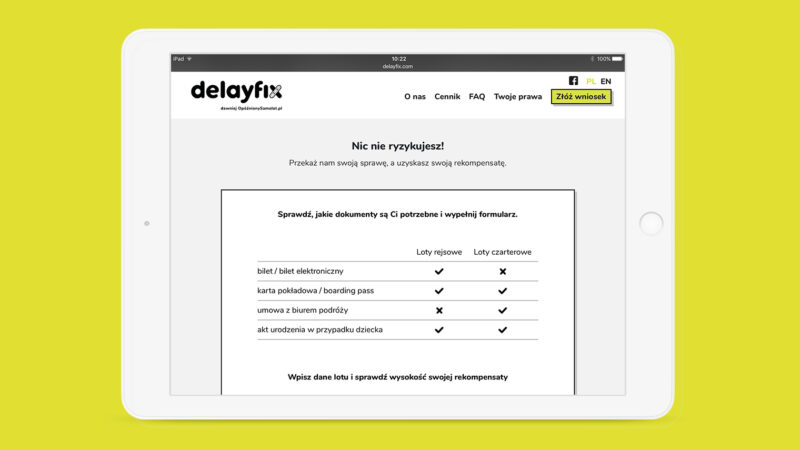
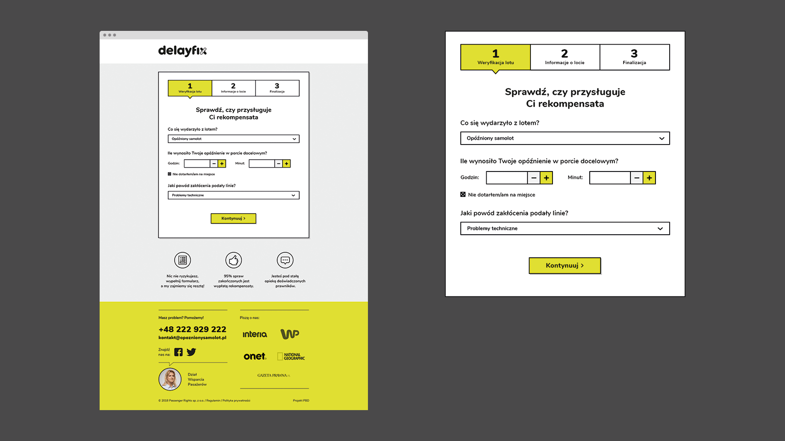
Passenger Rights’ new airline compensation brand – supports passengers affected by delayed or cancelled flights. The target group is airline users affected by a delayed or cancelled flight. The biggest advantage of the service is that the customer is not involved in legal processes and compensation is paid even before the trial.
We came up with the name ‘delayfix’ for the new branding, which directly illustrates the service. A pictogram of a patch is inscribed in the letter x of the logo. The patch, which symbolises a repair, an emergency treatment, directly characterises the main objective of the delayfix brand: the quick elimination of the damage caused in the form of immediate financial compensation.
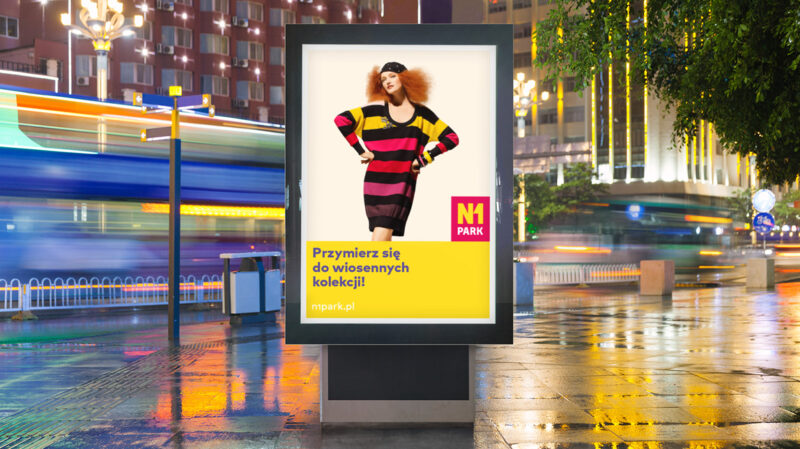
A functional retail and service complex in Bilgoraj built to revitalise the surrounding area. The investor’s aim was to create the largest shopping centre in the region.
Through a vibrant, colourful and distinctive identity system, the brand alludes to the city’s character as an open place with a strong sense of identity at the same time. The modern architecture and the visual identity system have been planned to emphasise the contribution that the building makes to its immediate surroundings.
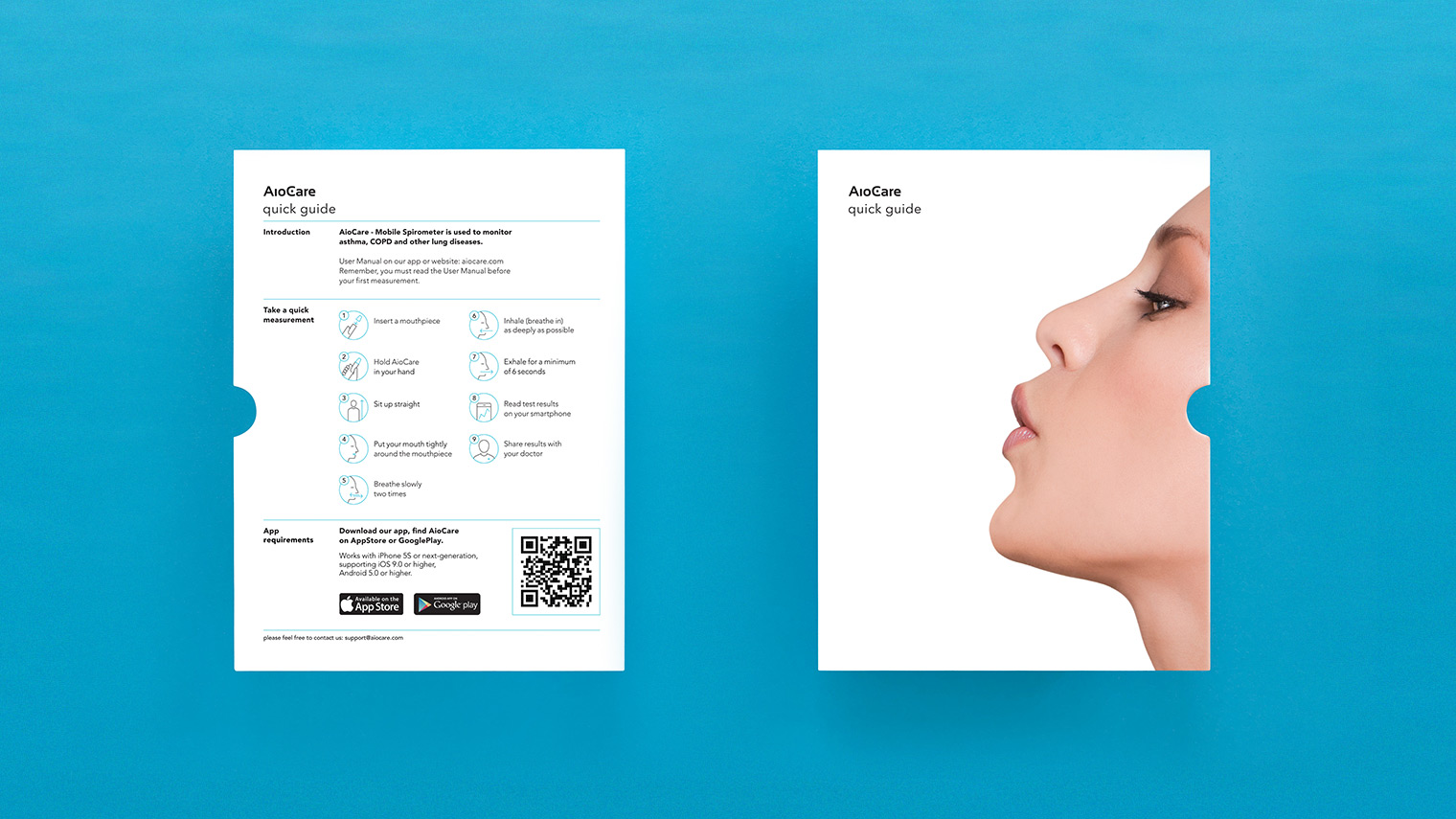
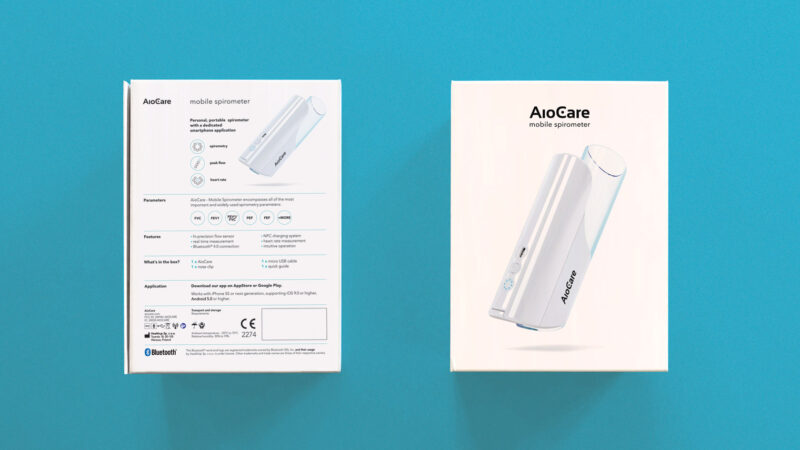
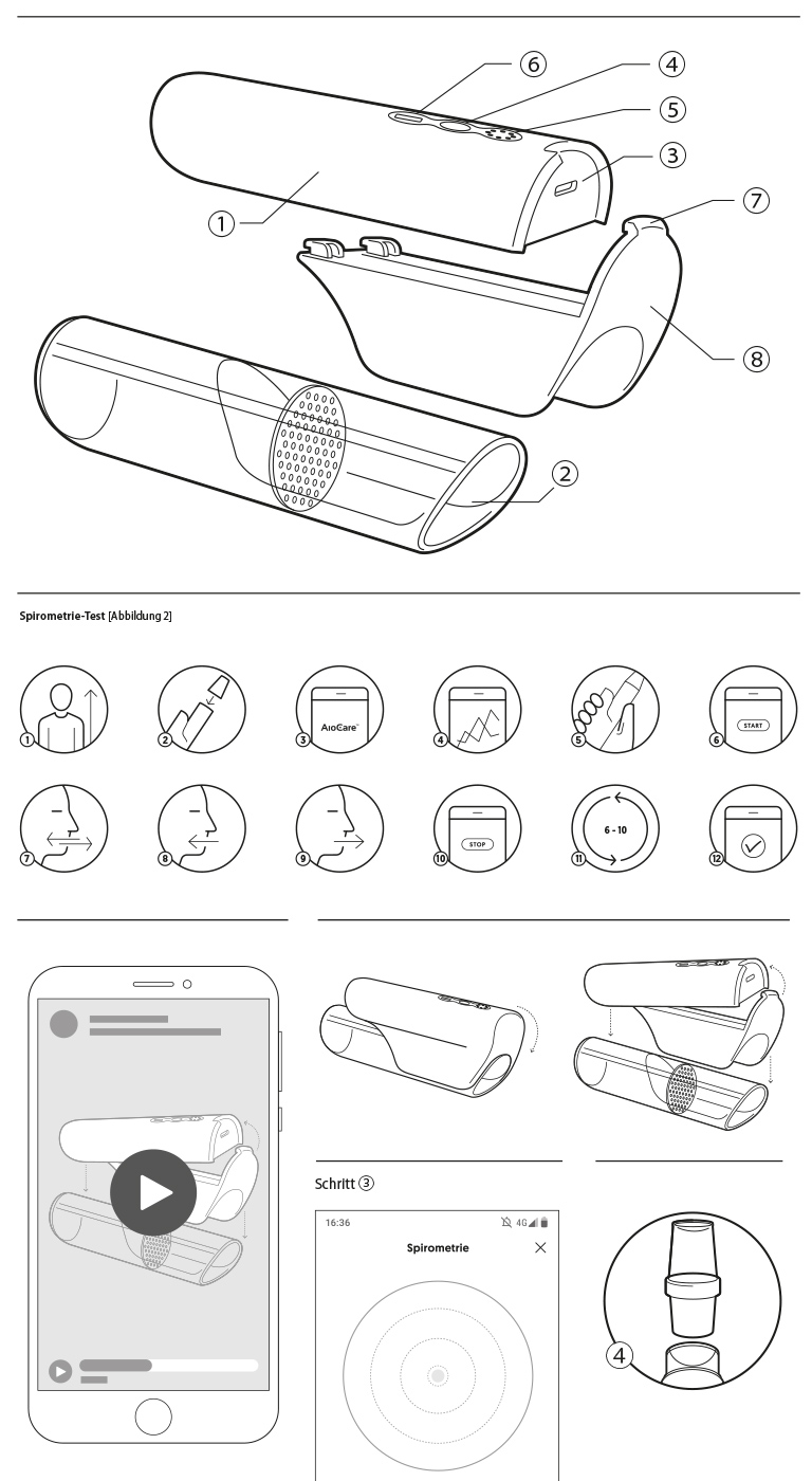
AioCare is a personal monitoring system that is extremely helpful in the treatment of lung diseases. It consists of a portable spirometer, a phone app and a panel for the doctor to monitor the results remotely.
For a Polish start-up, revolutionising the proper diagnosis of lung diseases, we prepared an outline of the visual identity reflecting its modern character.The main task set before us was to design the packaging for the new device. We considered functionality in terms of product protection and visual communication of its main features: innovation and high quality.
References
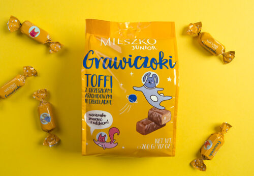
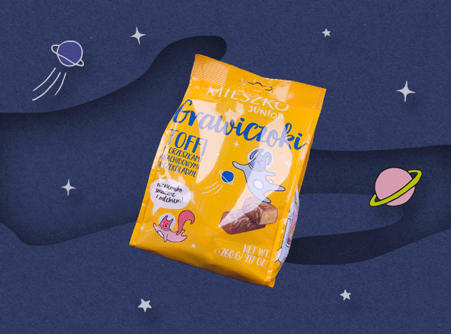
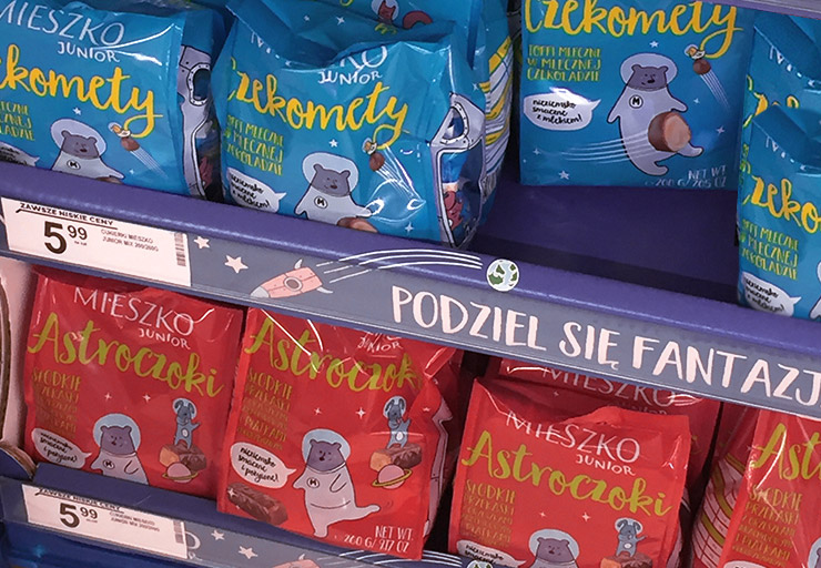
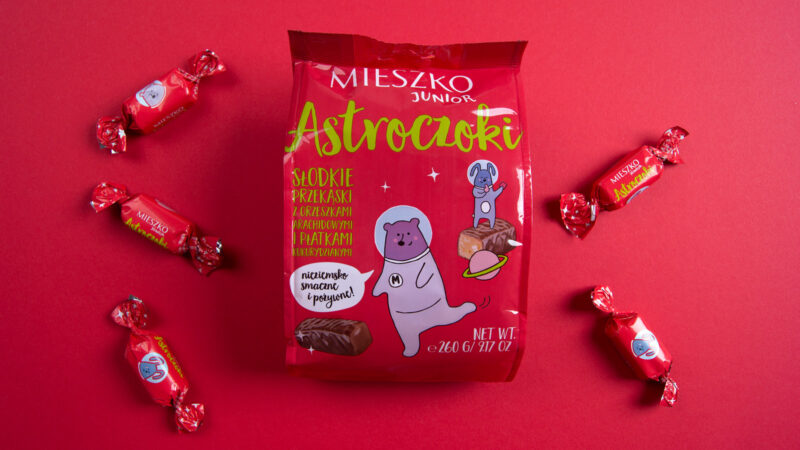
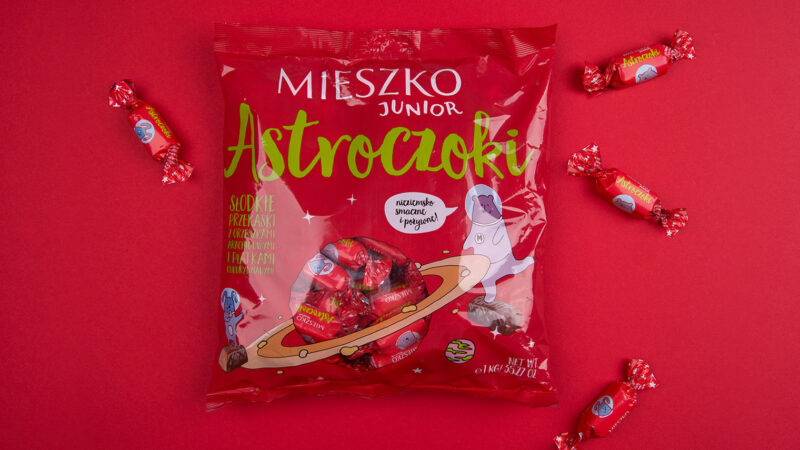
A new brand from MIESZKO S.A., a producer of chocolate sweets. Dedicated primarily to the youngest, it focuses on joy, freedom and sharing. Mieszko Junior creates unique and innovative products in an attempt to meet the needs of today’s young people, while stimulating their imagination and broadening their knowledge of the cosmos.
Mieszko Junior is not only delicious sweets, but also a metaphor for a cosmic journey. For the purposes of branding the brand, its world was developed to stimulate children’s imagination. The created brand heroes are a bunch of friendly animals, levitating in space, sharing their fantasy and knowledge of the cosmos with the youngest. The line of original packaging with brand heroes distinguishes the product and makes it more attractive for the child.
Brand heroes accompany children on every step of their cosmic journey, appearing on the wrappers of individual sweets as well as on bulk packaging. The real star constellations on the candy wrappers are an additional educational element.

Referens
I would like to recommend the services of PBD as one of the best-rated companies designing visual identification systems and packaging. (…) As a result of our cooperation, an inspiring brand world of Mieszko Junior was created, which, in my opinion, constitutes a complete base activating brand managers to further brand creation activities, and PBD has become a regular partner with whom we gladly realise further challenges of our brands.
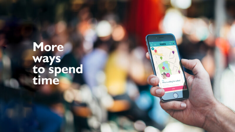
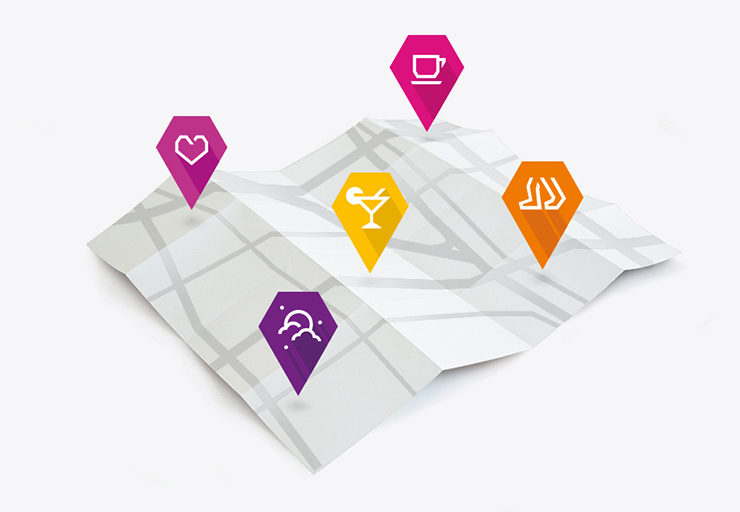
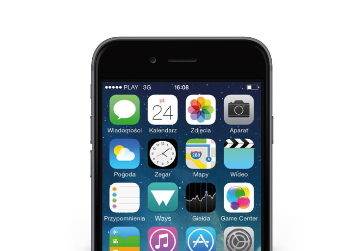
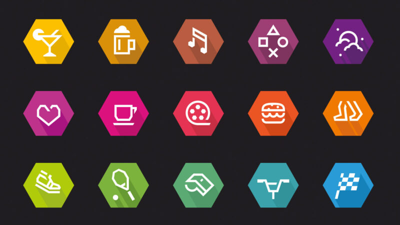
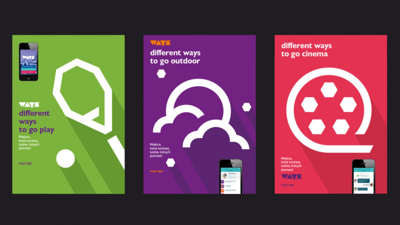
WAYS is a mobile application dedicated to young and independent people (so-called social natives), embedded in the culture of big city dwellers.
As a service with the unique idea of connecting communities in real life, not online, WAYS allows you to make friends with people who, like you, fancy the proposed activity. WAYS is a way to enjoy leisure time: a date, a coffee or a drink, a movie, a concert or a meal in new company.

References
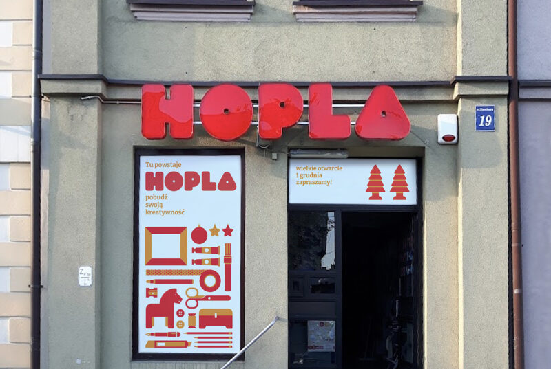
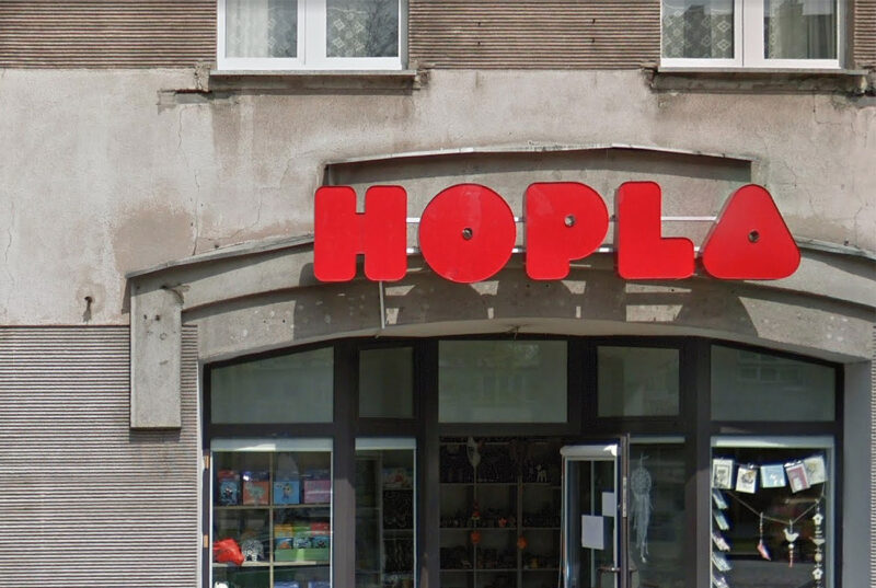
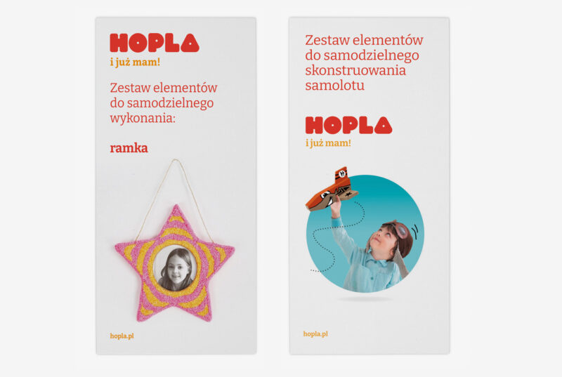
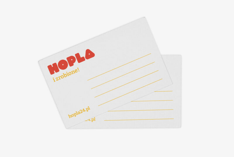
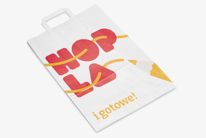
The brand sells articles for creative works for children and adults. The shop offers wooden and polystyrene articles, jewellery-making elements, foam art compounds and many other paper materials. We based the logotype on a blocky, dedicated typography alluding in its shape to children’s building blocks. We have also developed a verbal identity, with the word Hopla being complemented by slogans referring to rewarding fun.
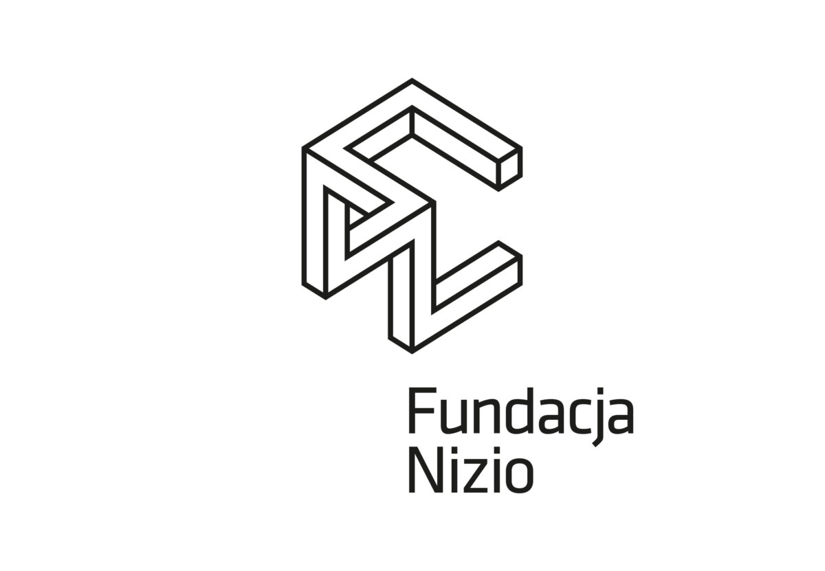
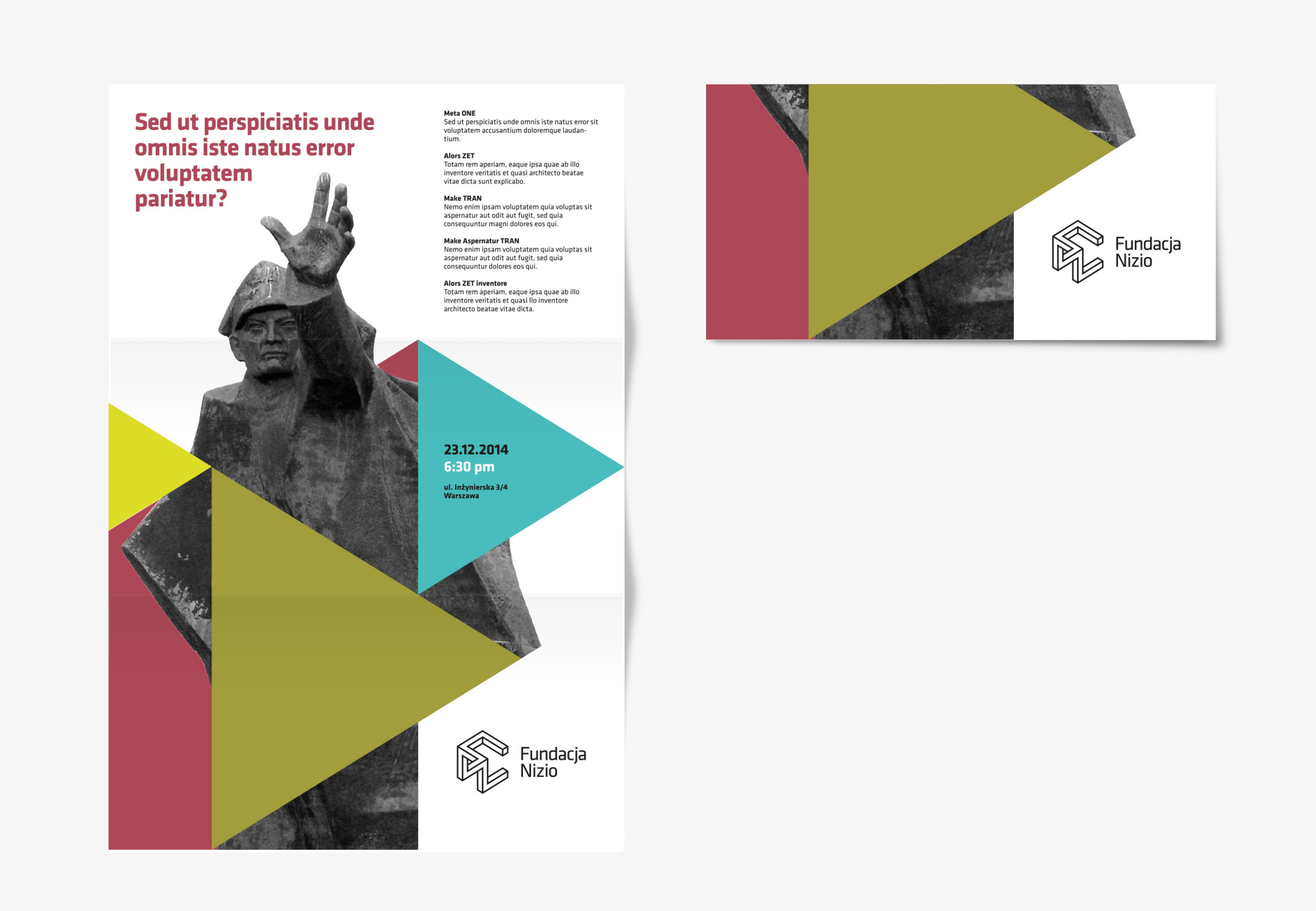
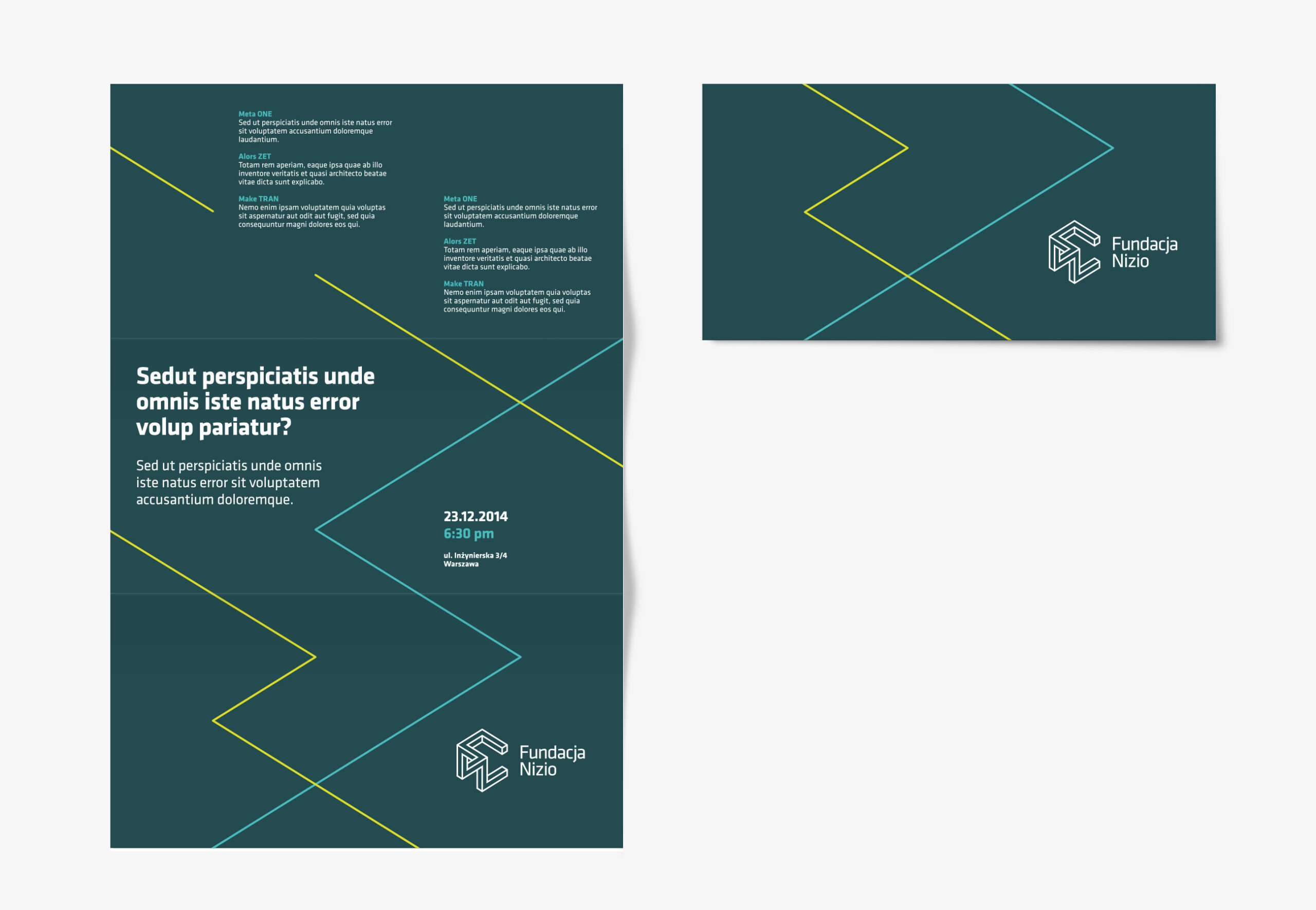
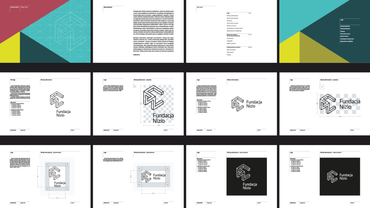
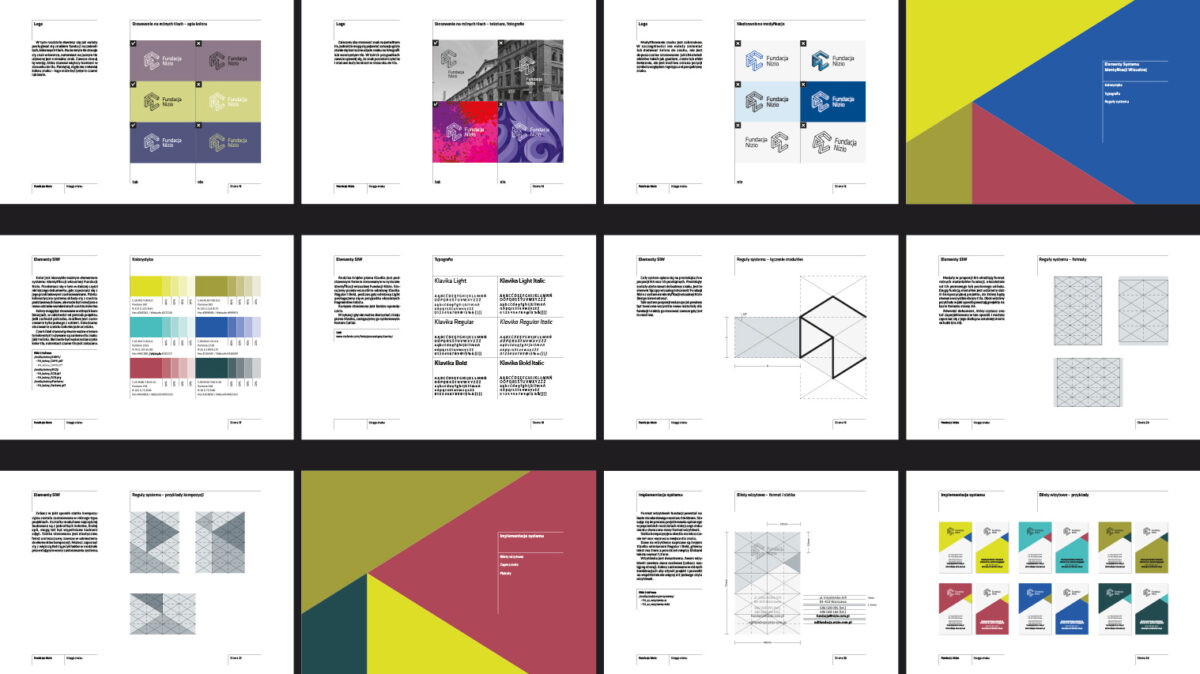
The Nizio Foundation operates in the fields of architecture, art and social action. Its approach to architecture is purely anthropological: the foundation focuses on the human being, his or her problems and relations with others, as well as the effects of human activity, such as art.
The foundation’s activities drive the revitalisation of the public space of Warsaw’s Praga district, in a broad cultural context. The foundation’s branding has been strongly linked to its mission, reflecting the mood of the constant transformation of the space and the nature of the complex relationship between the built environment and the people who live in it. The mark is inspired by the illustrations of M.C. Escher and the letters FN – the initials of the foundation’s name. The visual identity system is vibrant, multi-layered and open-ended, and like the foundation’s activities will evolve over time according to the designer’s decision to give this development direction.

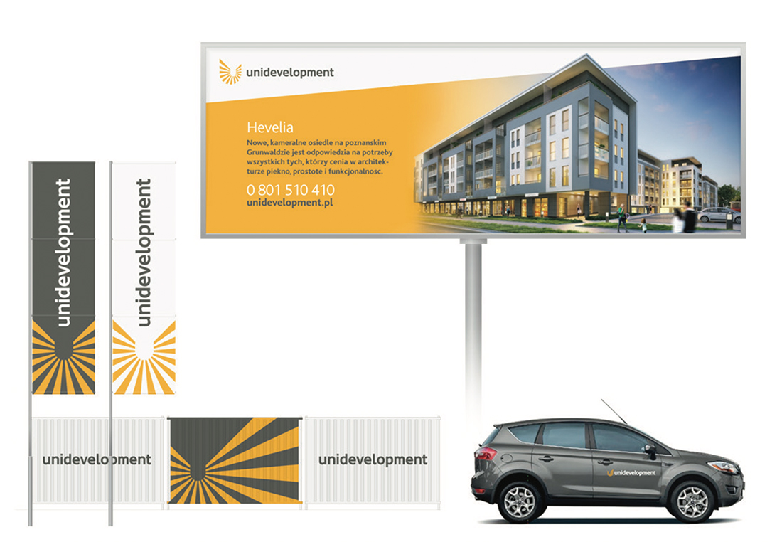
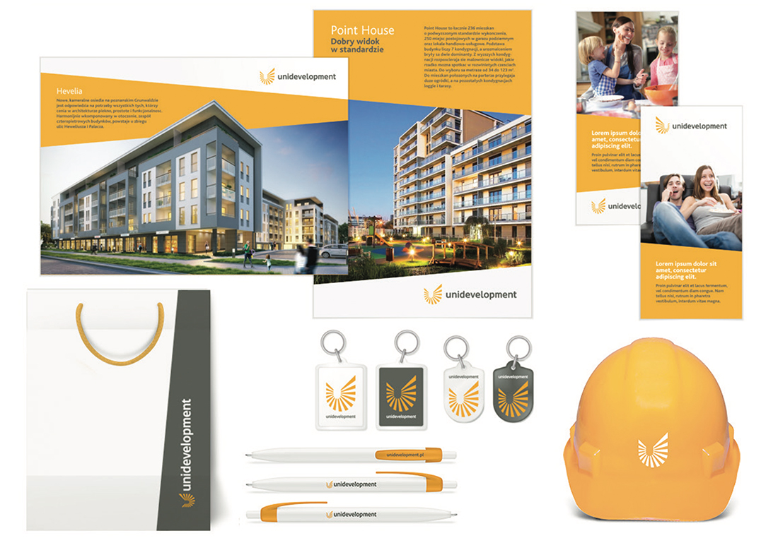
Unidevelopment S.A. is a Warsaw-based developer present in both the residential and commercial sectors. It professionally implements all its investments, taking care of the quality of materials and details of workmanship, as well as paying special attention to good design and interesting architecture.
In view of the planned IPO, the company decided to rebrand itself. The company was optimistic about the future, so a cheerful and friendly image while maintaining a professional character was our guideline when planning the system. We made the theme of the identity the ‘rays’ coming out of the elegant signet U – the first letter of the company name – and the resulting line at an angle of 5 degrees, which builds up the structure on all company materials.

References
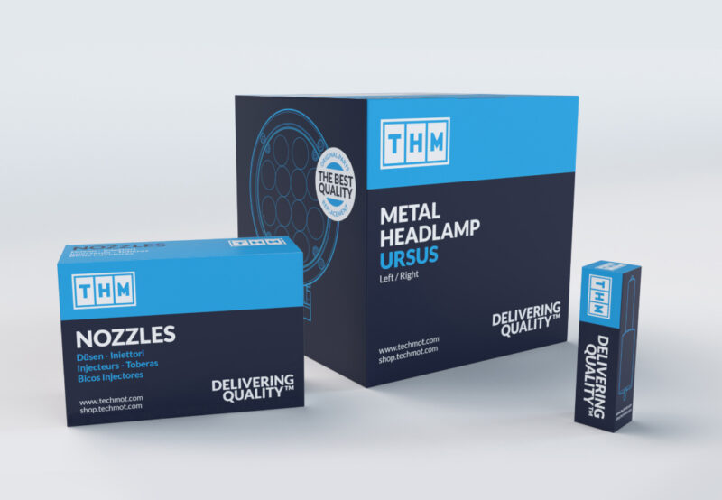
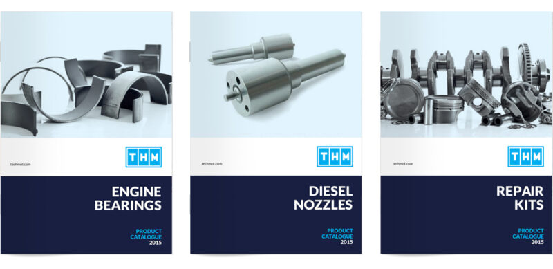
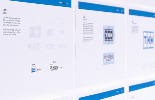
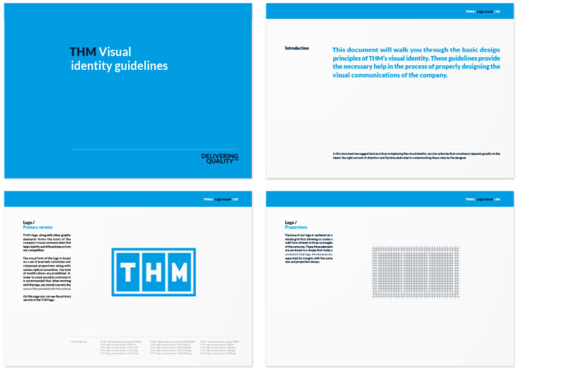
The brand offers a wide range of spare parts and accessories for tractors, agricultural machinery and trucks of both domestic and foreign production. THM stands above all for quality products, competing with the ranges of the largest players on the European market. The product range includes more than one million parts, thanks to which the brand is able to respond to almost all the needs of its customers.
With the THM brand, we label speciality products belonging to the culture-free category. For this reason, when developing the brand image for the international market, a standardisation strategy was chosen. This means that all materials have been visually standardised, while at the same time retaining the national accents of the respective markets, such as the national flag, product name and brand slogan in the regional language.
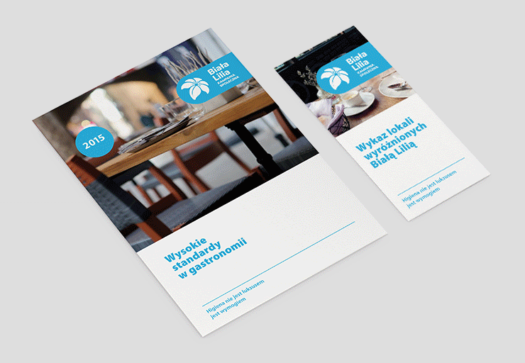
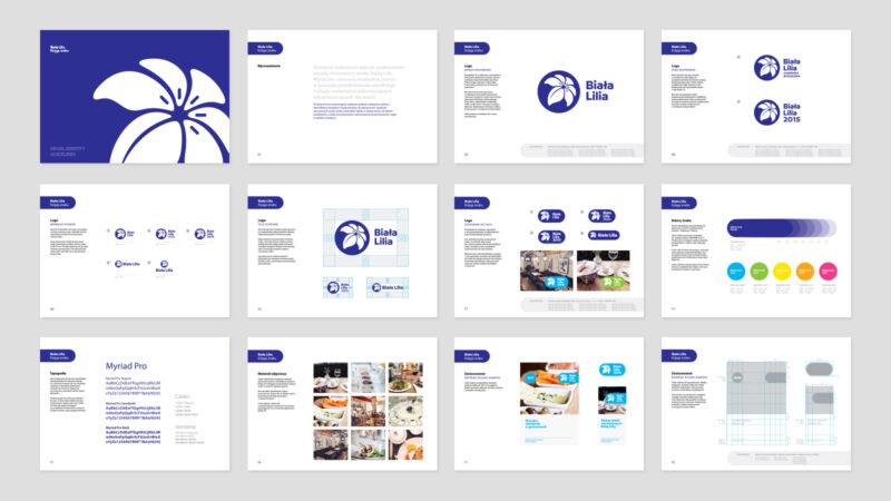
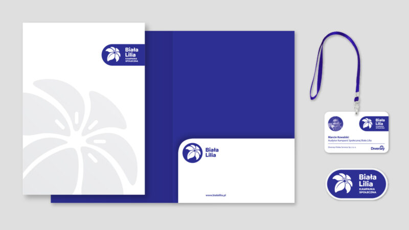
Refreshing the image of the programme , which is hosted by Diversey. The main objective of the Campaign is to improve hygiene standards in restaurants, cafés and other food service outlets. A secondary objective is to help Diversey experts and Higma Service staff to bring food production processes into line with Polish and EU legislation, particularly based on the requirements of the HACCP system. Restaurants that pass the audit will receive a certificate confirming a guarantee of safe service.
The campaign operates on the basis of audits and certificate recognition. Establishments that do not meet certain standards can count on detailed reports to effectively improve the hygiene level of the establishment. The brand managers work to ensure that a sign at the door or a certificate in a prominent position becomes a symbol of the quality of the restaurant in question and synonymous with the safety of the meals on offer.
References
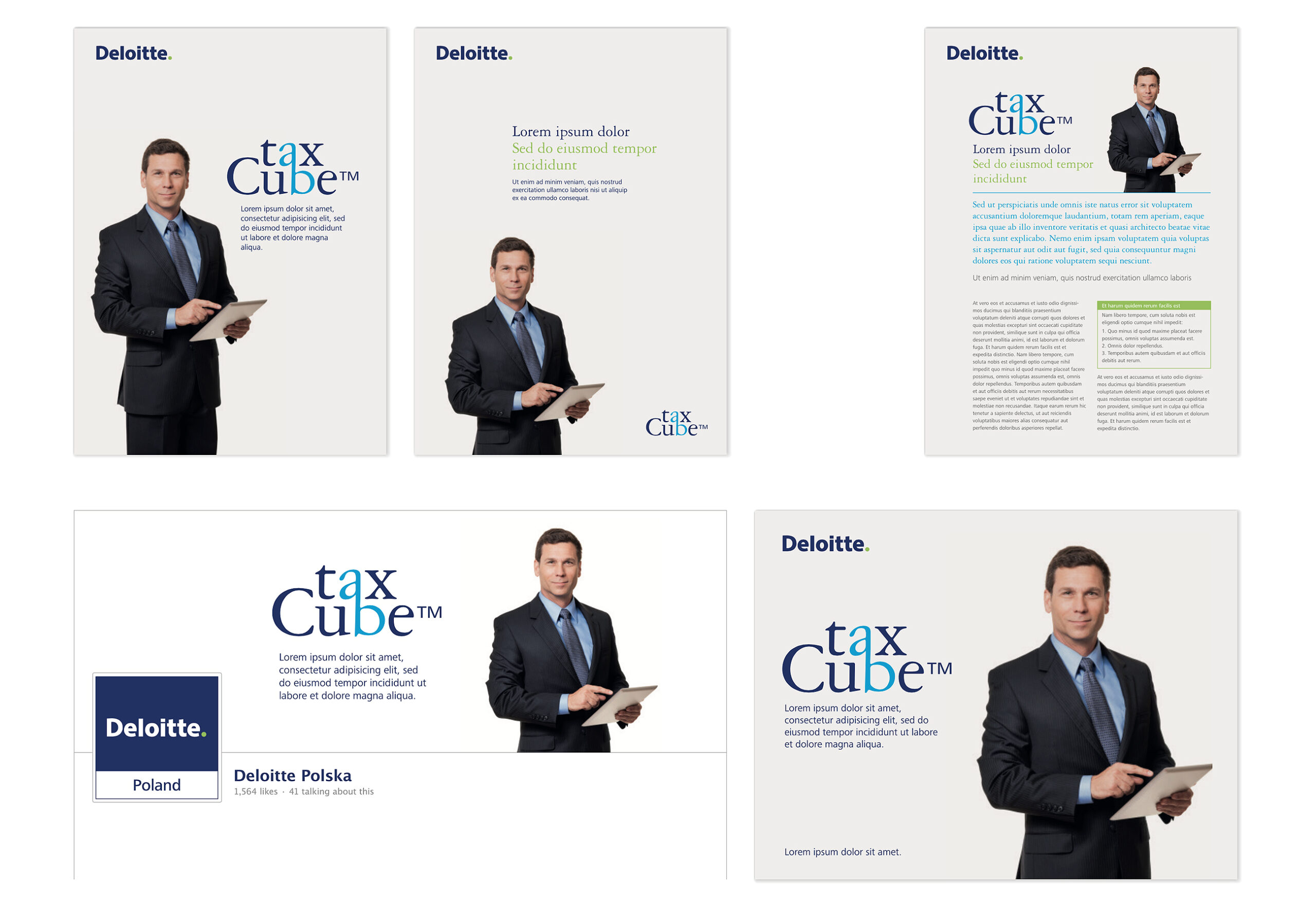
The taxCube specialist software is a comprehensive IT system for managing tax processes. Deloitte offers a tool that responds to a frequent problem of Polish companies where, despite the computerisation of other areas of the company’s operations, the sphere of tax settlements is treated marginally. “Tax engine” translates into significant time savings as well as minimises the risk of manual errors.
Full automation of settlements, in view of the Polish tax system, which is characterised by a high degree of complexity, is a solution that is steadily gaining in popularity. The product has been on the Polish market, however, the mark used to date did not meet the criteria set by Deloitte’s Global Branding Team. A word mark with ligature was created for the name taxCube, accompanied by a visual identity outline. The system remains consistent with the image of Deloitte’s current brands – it was created on the basis of the global image planning manual for initiatives and products under the Deloitte umbrella, which imposes many restrictions on the creation: it defines the allowed colours, typefaces and rules for the selection of photographic material.
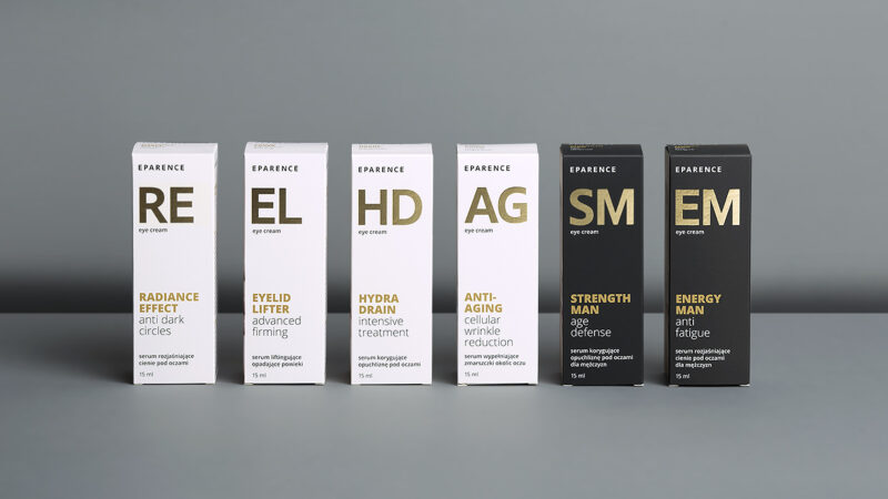
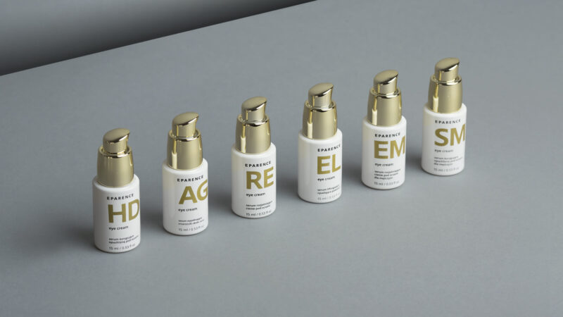
The brand responds to the growing demand for cosmetics designed to care for the sensitive skin around the eyes. The products contain the most advanced active ingredients from the world’s best laboratories.
The cosmetic line was created for women and men looking for creams that give real results, while being hypoallergenic and safe for sensitive skin. The brand debuted through market innovation by combining the latest technological and scientific knowledge with the world of natural active ingredients. The secret, however, is their percentage content. The brand was planned as sub-premium from the start.
References
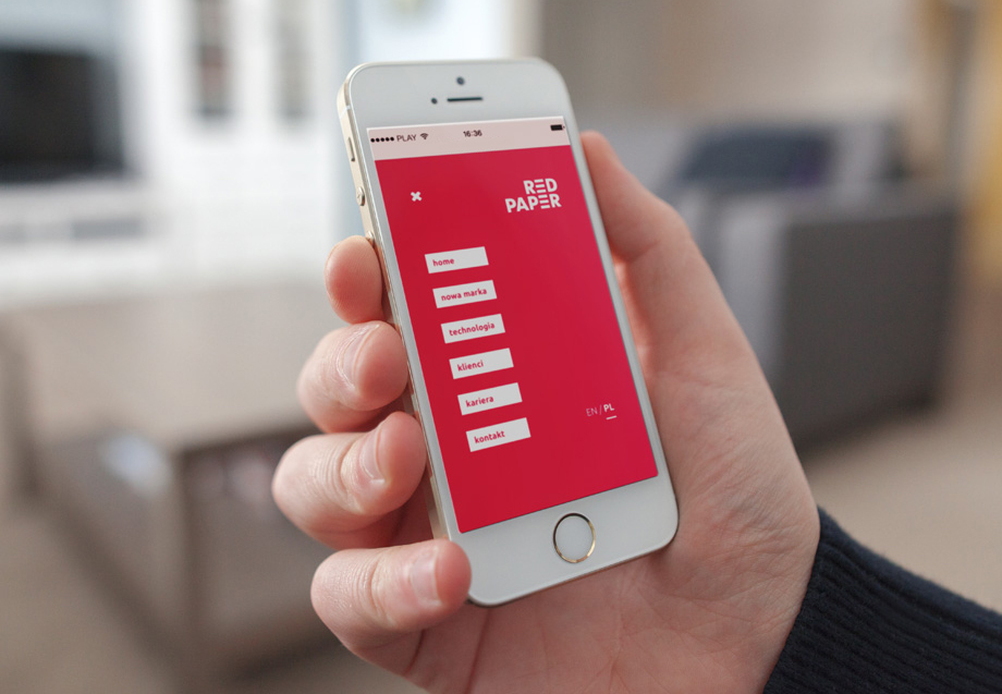
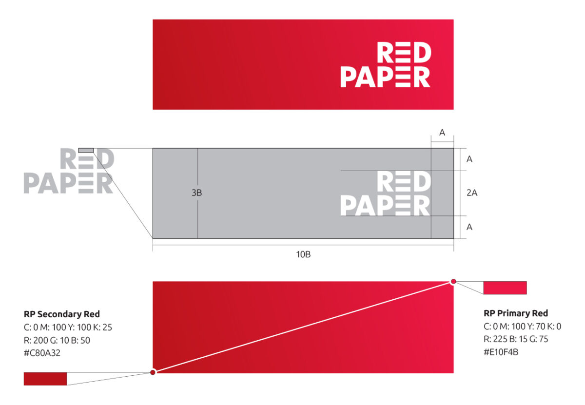
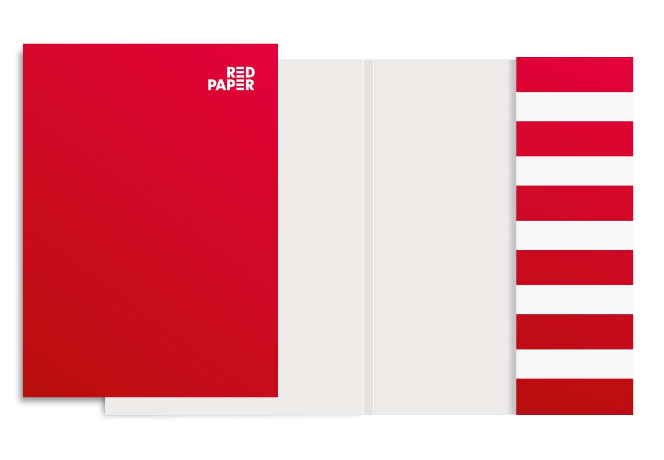
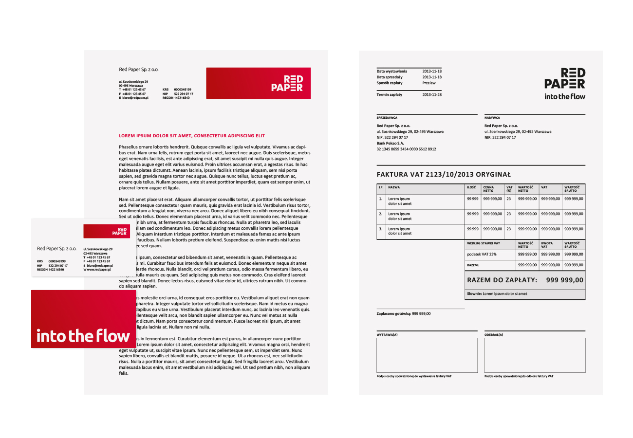
Red Paper is a team of experts dedicated to designing dedicated ECM solutions. The aim and effect of the company’s activities are personalised tools that help to bring a company’s processes, documents and materials under control. Work becomes a pleasure, access to content fast and convenient.
Among market experts in the IT industry, Red Paper stands out for its courage and ease in explaining difficult issues to customers. It is a brand that organises reality with courage and confidence. This is also how its product image should be – the mark is strong, at the same time the gradient softens the face of the brand giving it a friendly dimension. The ‘E’ in the logo is made up of rectangles as a metaphor for organising data. The red beams are the basic module of the system: further materials are built from the elements or based on their proportions – the rectangles appearing in the icons and on the website organise and structure the space visually.
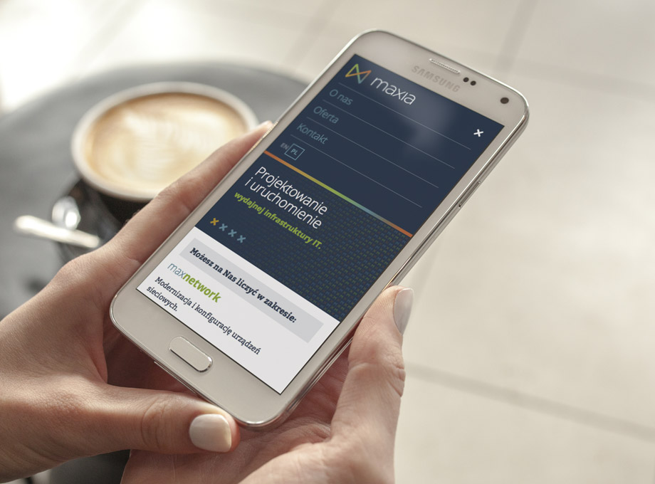
The company designs and implements network environments for business, guaranteeing maximum system performance and maximum data security. The company’s team can be counted on for both hardware configuration and upgrades and server virtualisation.
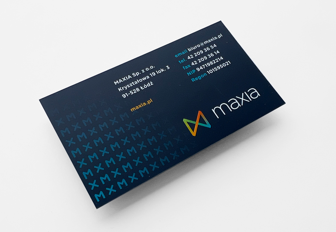
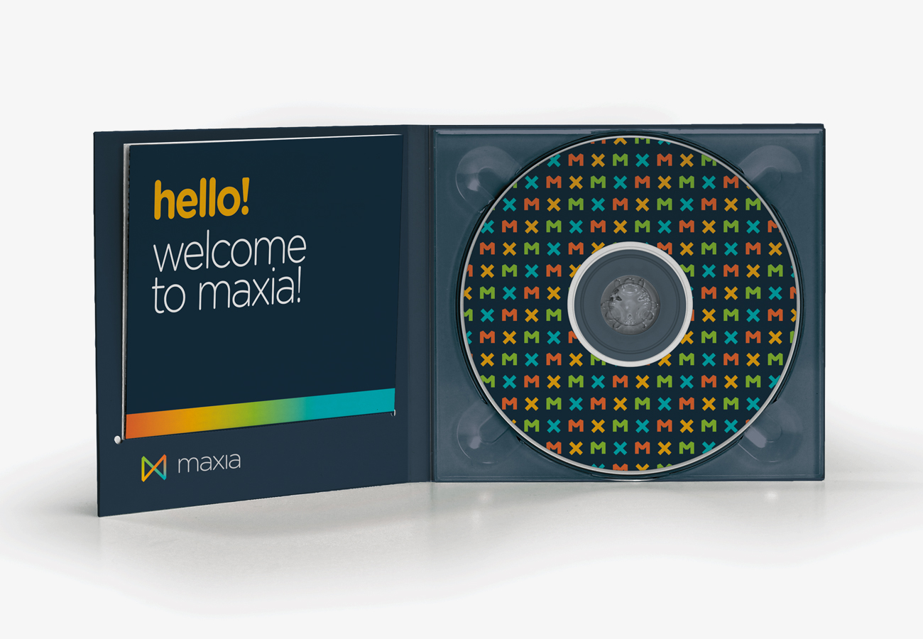
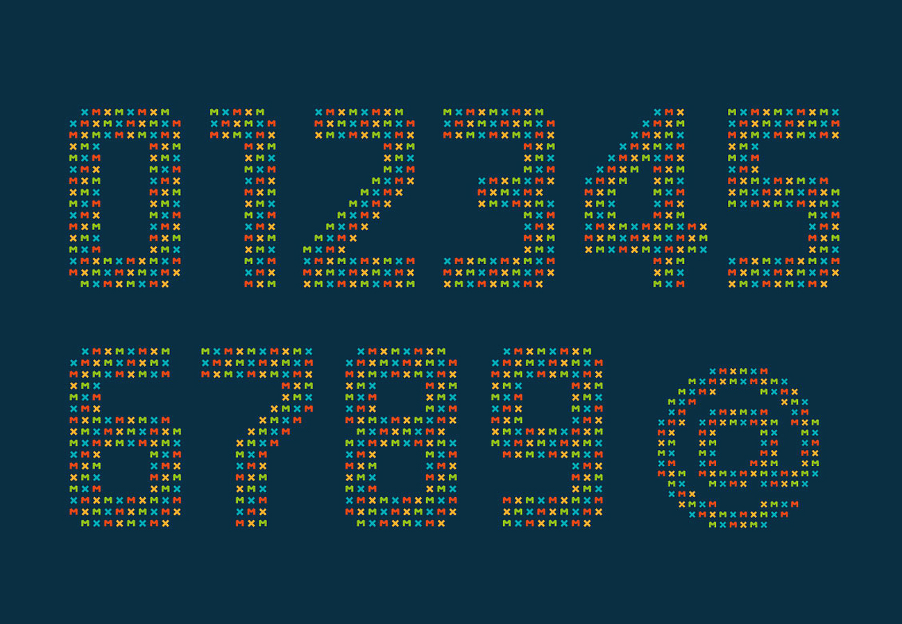
A start-up offering specialised IT services needed an image that was flexible, so that the system could evolve with the company as its portfolio of services expanded. The name “maxia” is a promise of maximum well-delivered service, the “max” segment offers virtually unlimited possibilities for the creation of service names. The letters M and X from the brand name were used as a pattern to add softness to promotional materials, and became a graphic module for building brand-dedicated infographics.
References
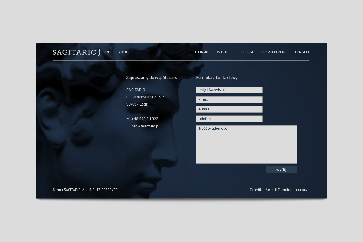
The brand deals with the recruitment of senior staff. Its main asset is that it is able to replace the HR department within a company. When creating Sagitario’s image, we relied on simple means of expression. The central idea is the metaphor of a marksman, who is able to select the right people from a group of candidates. We made the leading colour the navy blue of the night sky.
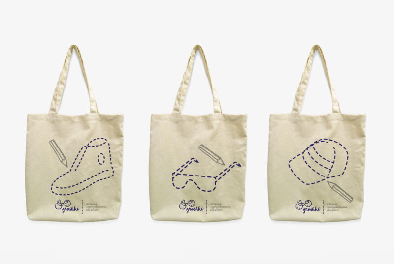
An online shop brand with a profile of children’s clothes from selected Dutch and British brands. The shop’s product portfolio consists of brands that offer clothes in a unique style, well designed, made of natural materials, with non-standard patterns and colours. Our task was to design a visual identity in the trend of urban chic – children’s alternative fashion.
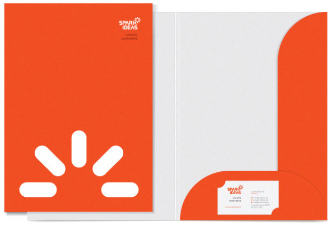
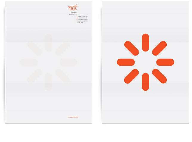
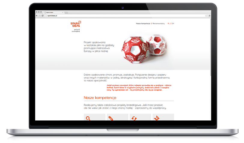
Spark ideas is a creative agency focusing on premium packaging design – its speciality is combining design and paper into a single, attractive and functional spatial form. In designing the identity, we started from the concept of ‘spark’ by incorporating a star into the logotype. As a brandline, we proposed a play on words combining the idea of clever packaging design with art (“smart – art packaging”).
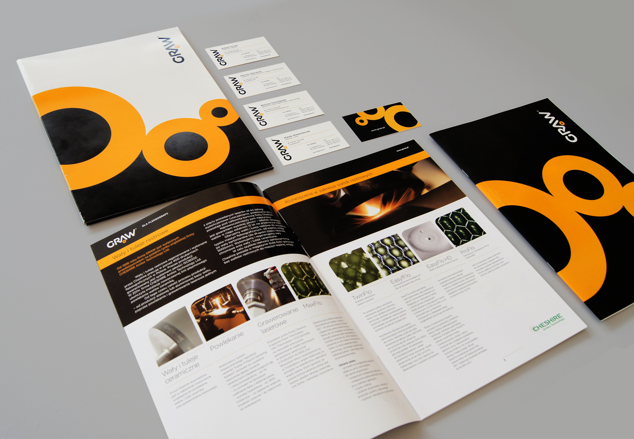
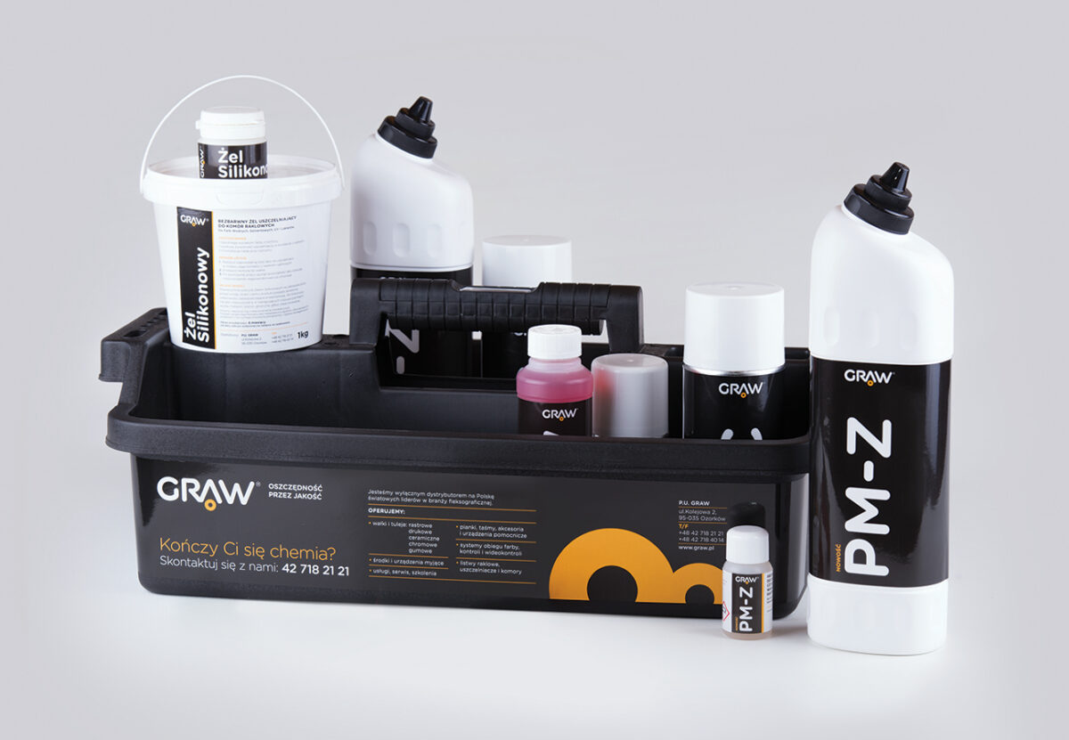
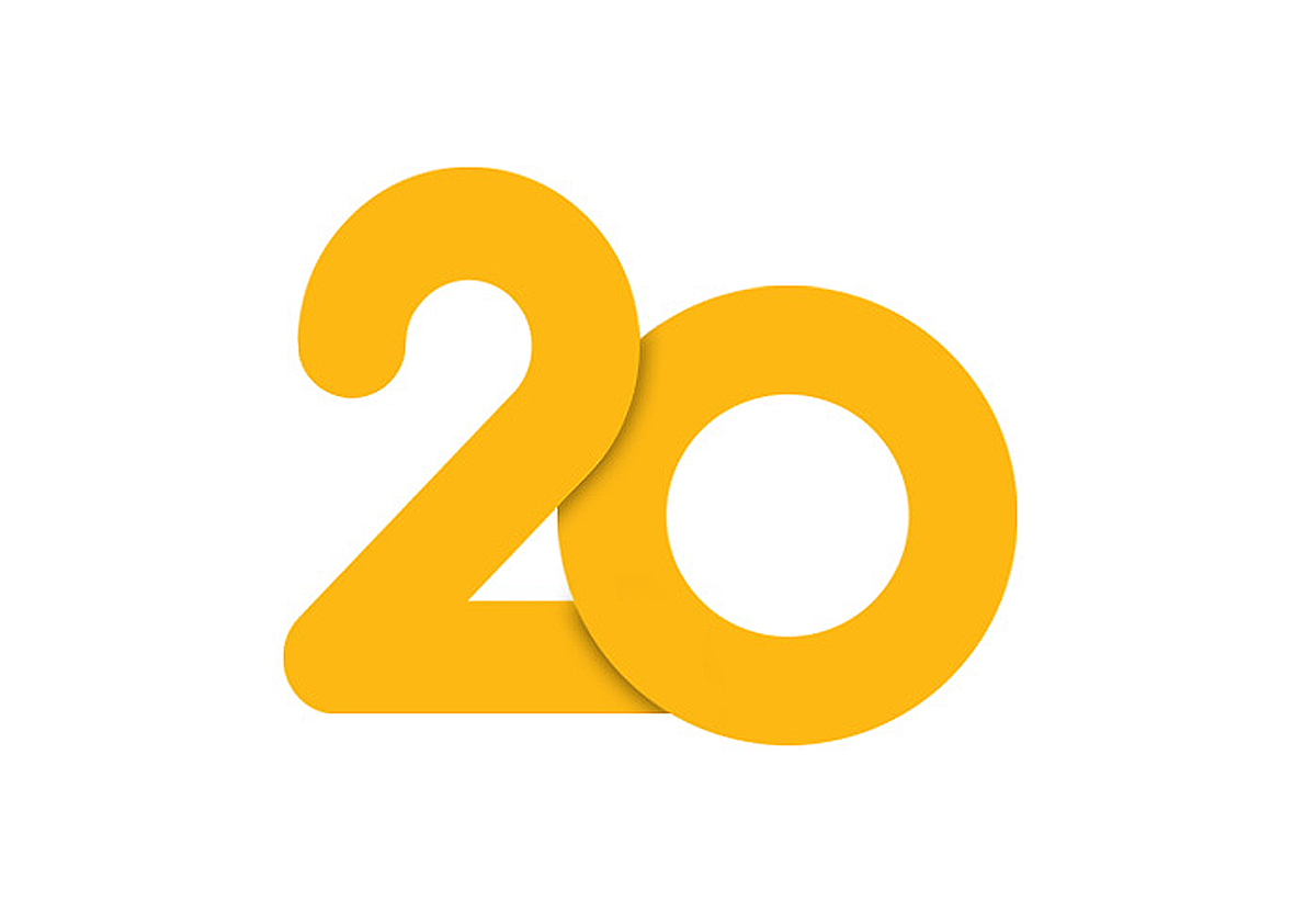
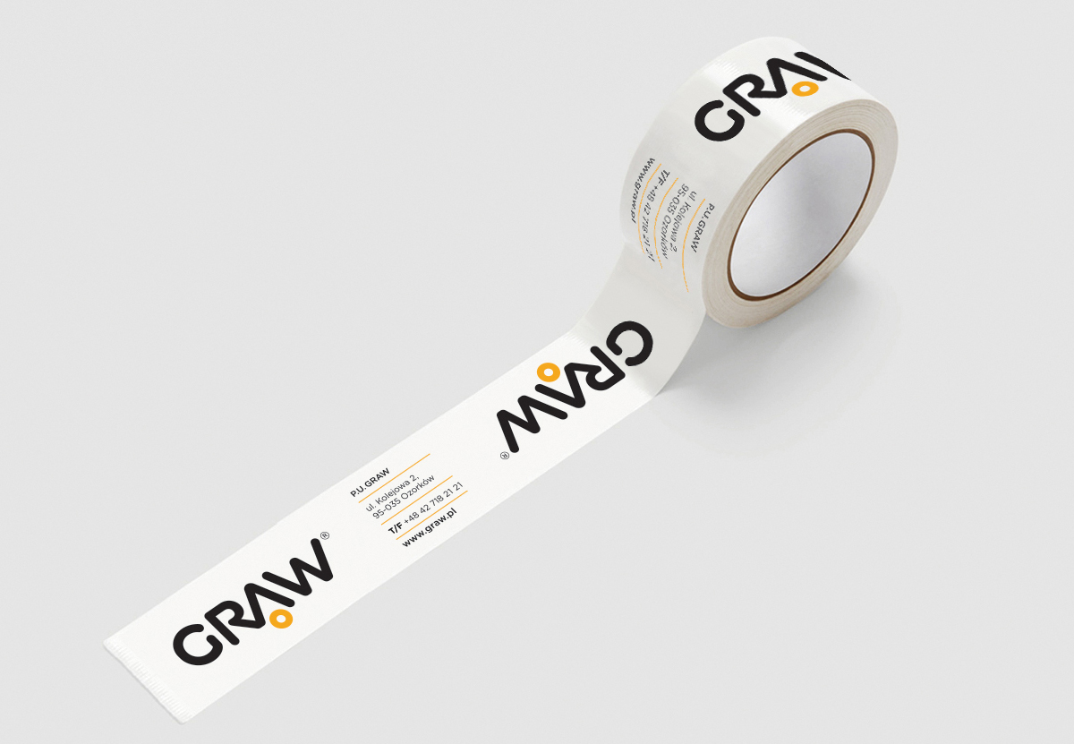
The company is a representative of the largest European brands offering products for flexography. Facing its 20th anniversary as a highly specialised, largest distributor of this type in Poland, the company felt the need for change – the owner decided to refresh and systematise its image.
The decision to rebrand was a nod to P.U. Graw’s existing satisfied customers and to assist in the internal integration of employees. The existing company colours were retained. The graphic design of the identity reflects the true nature of work in the flexographic industry. The system’s yellow circles are inspired by the form of a printing raster, as well as the cylindrical shape of printing press rollers.
References
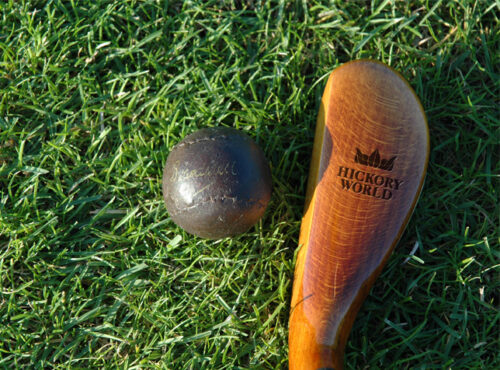
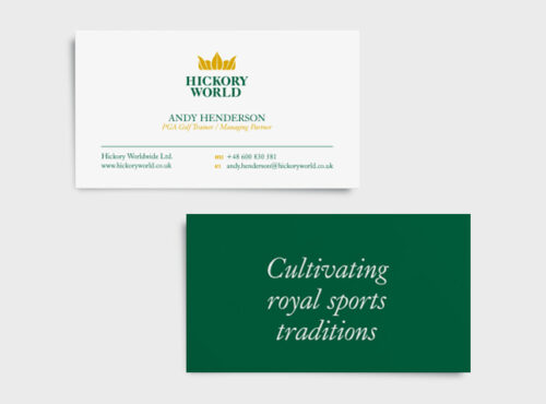
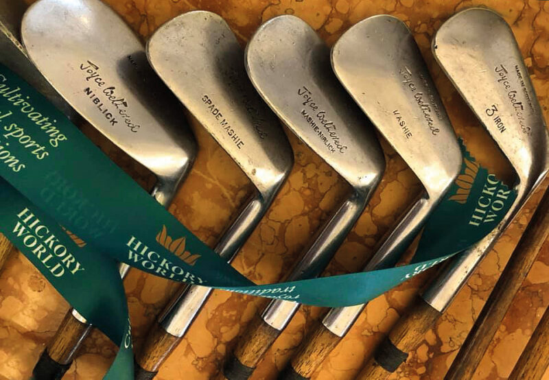
Hickory World is a club for business and cultural people interested in golf. The club’s partners range from golf courses to high-end restaurants, hotels and premium brand manufacturers. Our task was to design a logo symbolising the highest quality. In the sigil, hickory leaves in a shade of autumn gold, fold into a crown. The club motto we created, ‘Cultivating Royal Sports Traditions’, completes the logo in a meaningful way.
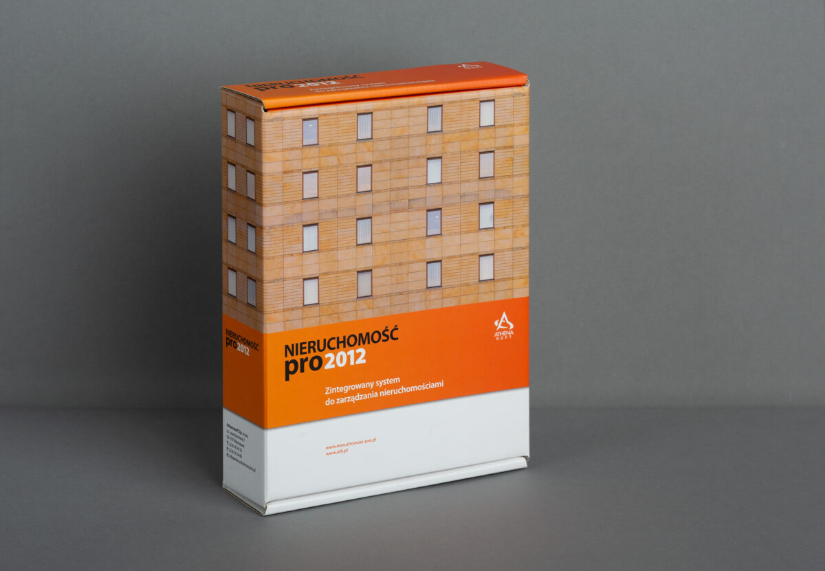
Real Estate PRO is a highly flexible property management system. It allows both typical and highly individual solutions specific to the management company to be supported. Our task was to develop a distinctive branded package, referring to the specifics of the system. The manufacturer of the software is Athenasoft.
References
Stones World Ltd is a UK-based company distributing sandstone-based finishing raw materials. The proposed material, in the form of decorative coatings, is available in natural colours, imitating ancient Mediterranean plasters. Building facades covered with sandstone materials are durable and aesthetically pleasing.
Durability and aesthetics became the two variables from which we began our search. Inspired by ancient art, we decided to use elements of Greek mythology in the creation of the company’s image. The head of Zeus – the ruler of the gods – became the brand symbol. The product positioned as the top brand was given a royal face, and we chose gold as the dominant colour.
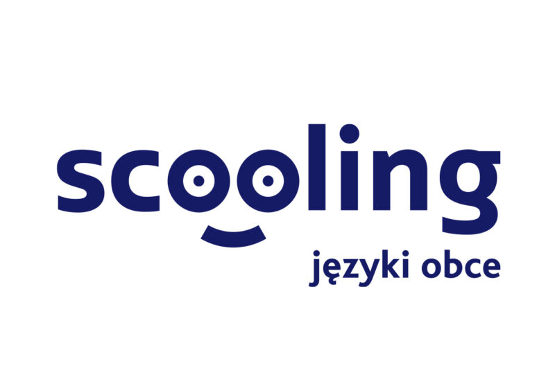
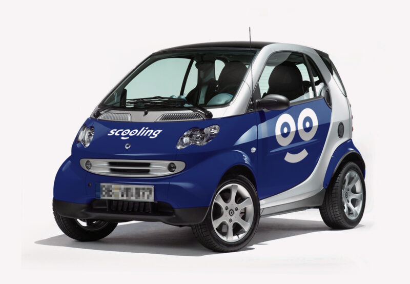
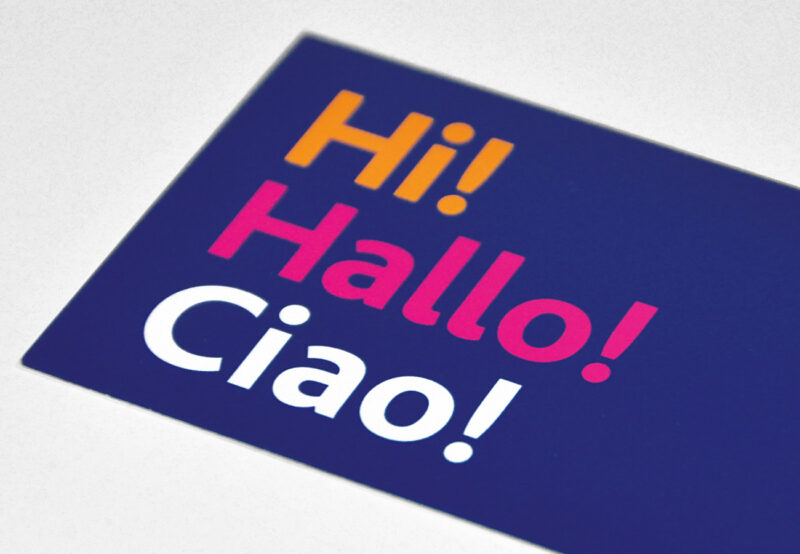
Scooling is a mobile language school with a unique character. The school offers classes in English, German and Italian, which take place both on-site and at the students’ homes. Lessons are conducted using the communicative method.
The pleasant word ‘scooling’ has roots in English, which gives it a universal appeal. The friendly form of learning is emphasised by greetings in different languages used as part of the graphics on the school’s materials. An additional module of the system is the smiley face of a pupil wearing glasses emerging from the logotype emphasised with a smile. The background and main colour of the brand image is a warm navy blue, reminiscent of the shade of old school aprons.
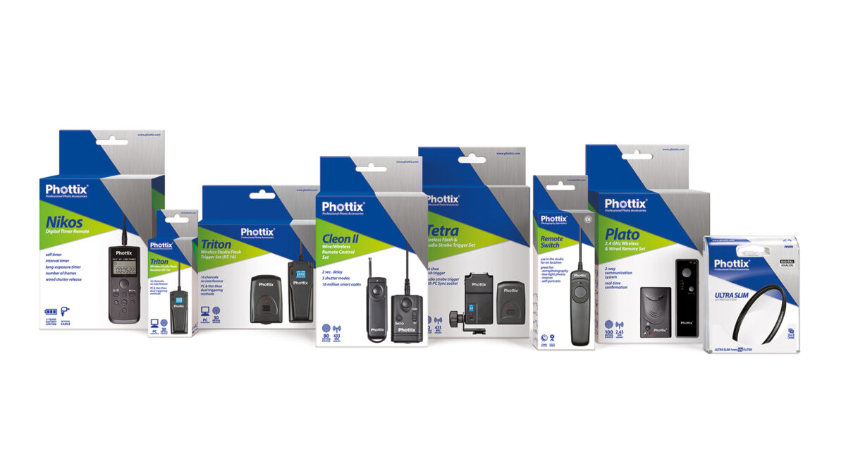
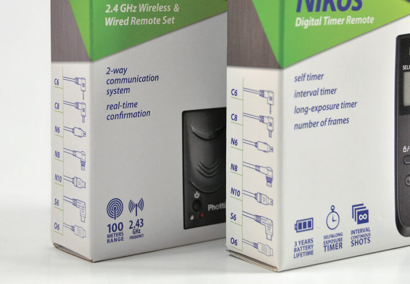
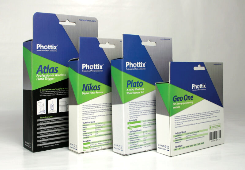
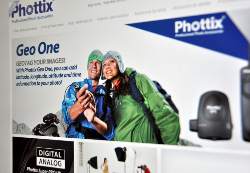
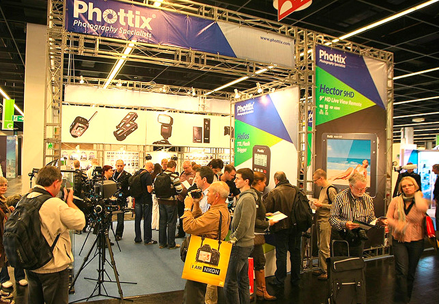
Phottix is a rapidly growing manufacturer of photographic accessories for professionals. Phottix is a brand that is constantly in dialogue with photographers, meeting the needs of the market by constantly improving its product portfolio and introducing innovative, groundbreaking products.
Due to the strong expansion into the European market, the decision was taken in 2009 to undertake a comprehensive rebranding. Work on the project lasted twelve months. The company needed a consistent image that presented the product in a more accessible way. The company’s logo was already well-known in the photographic industry. However, it had some shortcomings, so after a thorough analysis, we only carried out a facelift. The main graphic motif, which is reproduced on all materials, was created based on the camera aperture symbol from the company logo. We developed a new hierarchy of information on the packaging. The brand’s promotional and information materials were also streamlined.
A company offering a system for the handling and settlement of sales. The solutions proposed by Billin are used wherever there is a need to automate processes in the area of billing (cyclical and one-off), as well as in the process of issuing different types of invoices or settling different VAT rates and forms of payment.
In developing the company’s image, we were guided by the objective that accounting optimisation should be associated with profit growth. The logotype complements the idea expressed by the brandline “We give shape to finances” – it indicates the direction of finances, suggesting both a constant and dynamic growth trend. The slogan emphasises the complexity of the Billin system, broadening the horizon of perception, suggesting the causal possibilities of the services.
References
We are extremely pleased with the results of cooperation of a long-term nature – both graphic design and substantive assistance and valuable advice on how to build a strong brand remain extremely useful and relevant. it is also important to us that the projects are always performed at the highest level, efficiently, on time and taking into account our needs and comments.
Graffest is an international graffiti festival, the project was the result of a collaboration between the Wyspa Institute of Art located on the former site of the Gdańsk Shipyard and a group of young artists, cultural animators and art curators from the Tricity. Our task was to develop the entire visual setting for the festival.
Graffiti is a subculture that stands in opposition to social norms. We decided to incorporate these characteristics into the event’s identity. We created a visually aggressive sign in which the shapes of the individual letters are blurred and form begins to take precedence over legibility, as is often the case in the work of graffiti artists.
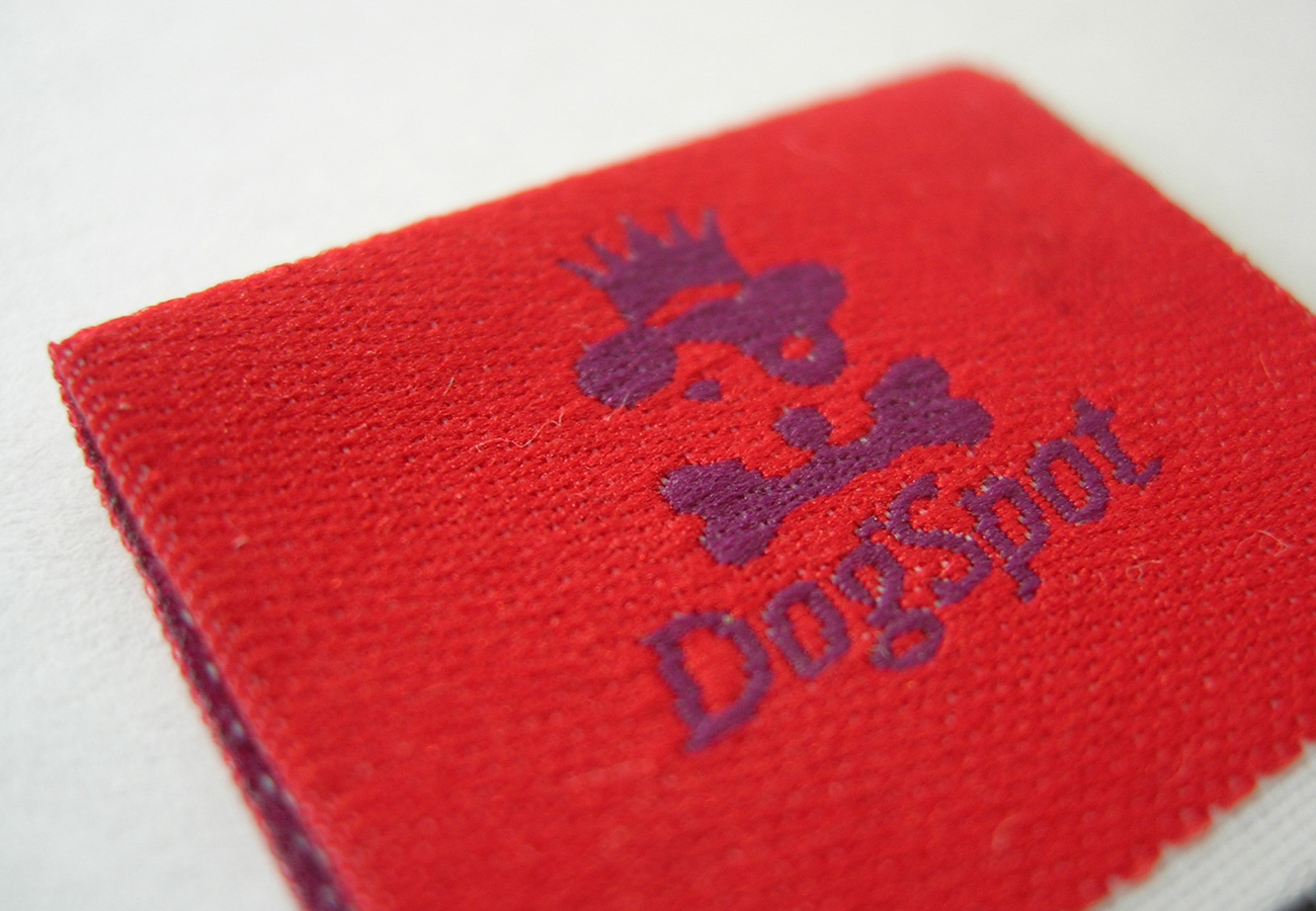
Manufacturer of dog beds and accessories for small dogs. The main motif of the new identity is the head of a small dog topped with a crown. On the one hand, it symbolises the quality and nobility of Dogspot’s products and, on the other, it shows that the dog’s favourite animal is treated with the utmost care and attention, simply like royalty.


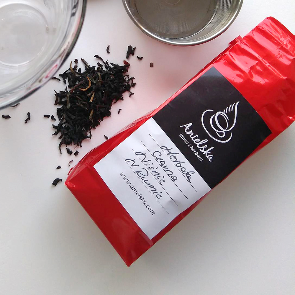
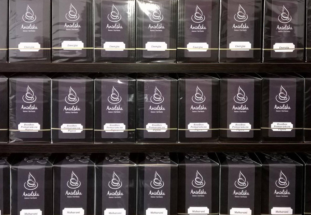
Anielska sells natural coffees from all regions of the world. Freshly roasted using the traditional method, cooled using only air, as well as flavoured beans and instant coffees. Our aim was to use simple means of expression to convey the richness of flavours on offer in the shop and café, and the artisanal character of the business.
The non-profit organisation ‘IFOSS Law Review’ is an international periodical dedicated to the legal aspects of free software. The publication is run by an editorial board of well-known lawyers and practitioners from around the world. The aim of ‘IFOSS’ is to discourse on the rules and legal principles of the use of free software.
For the new initiative, we designed a logo that combines the meaningful symbols of law and digital technology. The scope of work also included the layout of the periodicals and the design of the website.
References
The company provides IT systems support for businesses that are looking for solutions to effectively use technology to gain a competitive advantage. The team includes, among others, system engineers, experts in backup and storage systems as well as database administrators and programmers. We created a name for the newly-formed enterprise, as well as a signet which allegorically reflects the company’s mission. The symbol became an open hand held up in a gesture offering light – a symbol with many positive meanings, such as intellect, knowledge and evolution.
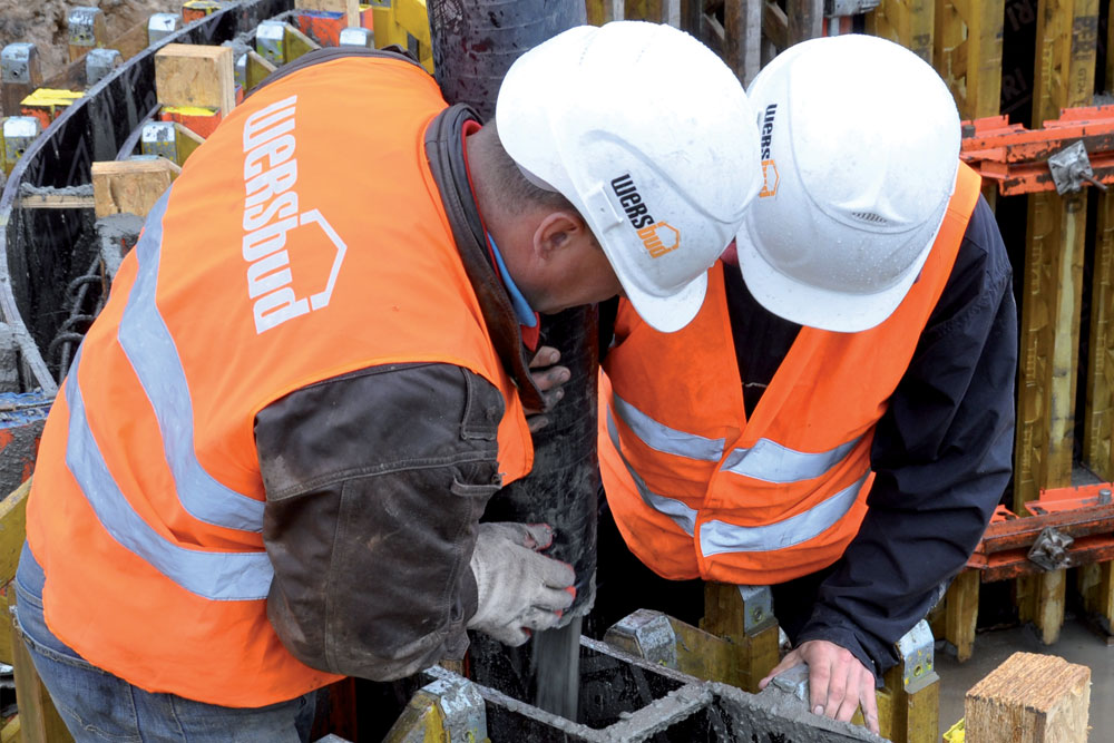
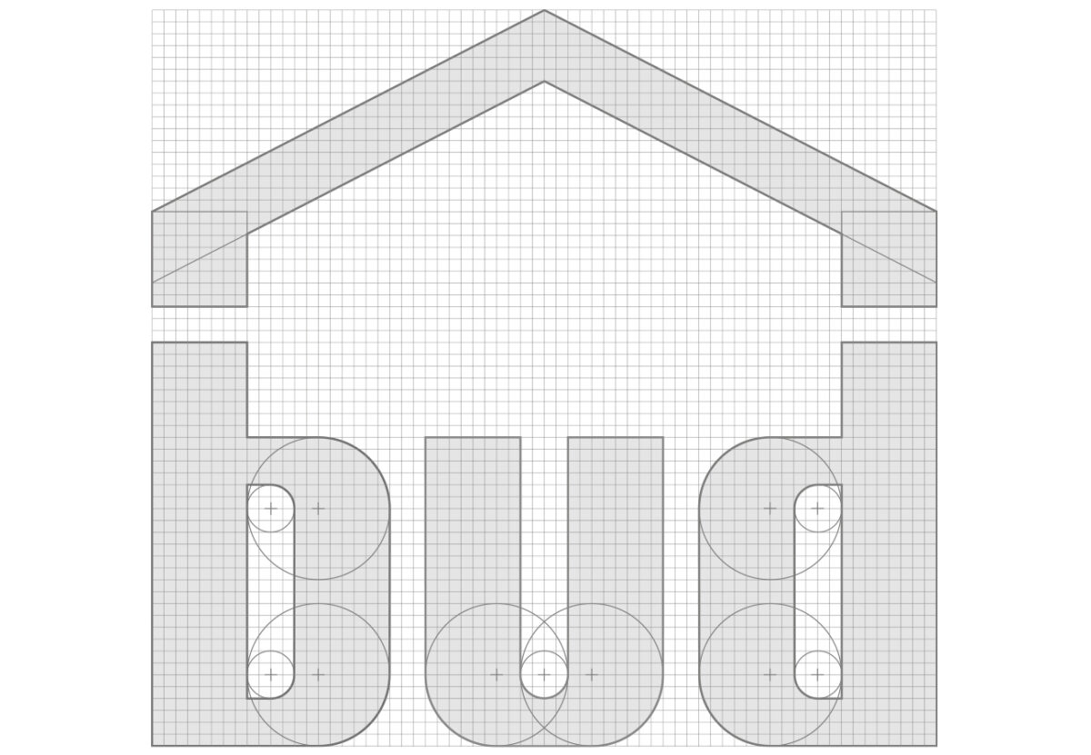
Wers-Bud renovation and construction company performs construction and installation works in the general contracting system. Cooperation with the company allows for a reliable valuation of the scope of works and, as far as possible, for the reduction of costs connected with investments by undertaking cooperation with one entity.
The company needed an image that reflected its professionalism and wide range of services. The construction of the letters in the logotype communicates the company’s reliability and stability in the market. The final part of the name “bud” was closed with a vault, so that the sign evokes associations with the construction industry. The slogan “We know all about building” was created for the project, informing clients that they are entrusting their investment into the right hands.
A company dedicated to importing high-quality food products. The logo visually represents the organisation’s business model – the premise of Tastes of France was to sell wine in a carefully selected selection of high-quality French specialities.
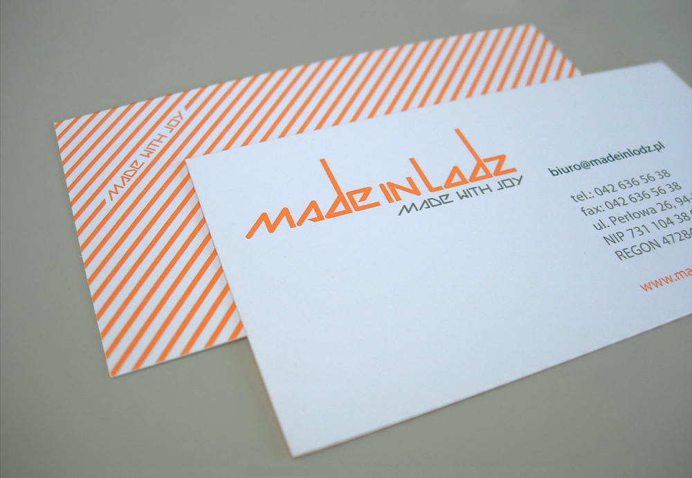
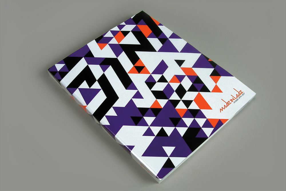
The company is in the business of manufacturing a wide range of cardboard packaging. Due to its dynamic growth, it needed a set of tools to differentiate its offering from the competition. Our task was to develop a strong and clear symbol.
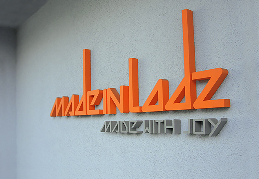
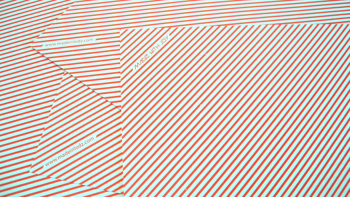
The easily remembered name of the production agency was clothed in a form alluding in shape to the recent factory landscape of the city of Łódź, full of chimneys and stepped factory roofs. The brandline became the slogan “made with joy” reflecting the mission of Made in Lodz. The agency approaches each entrusted task, even one that seems impossible, with great optimism.
References
Everyone will find something for themselves in our works. Click on the keyword that interests you and see what happens we did it.