Perform Brand Design

Cart

Żak Szkoły

Works well in practice

Klient
Żak Szkoły
Rok
2018
Zakres

Leader of post-secondary schools in Poland. It operates establishments in more than 80 cities spread across the country, locating them in a way that ensures easy access to learning for people from every region.

ŻAK directs a wide range of courses and training to young people wishing to shape their career path quickly and effectively by learning to practise a specific profession.

When developing the rebranding, we focused on the client’s target group and the typical way they communicate – short text and graphic messages. We designed a dedicated corporate typeface, enriched with a set of pictograms that, combined with short slogans, create messages that stand out in analogue and digital mass media.

Write something...
Write something...

The main elements of the visual identity – typography and pictograms – appear on all company materials.

The brand’s communication on social channels also takes place through an elaborate iconographic language. Pictograms appear in images in spatial form or as messages accompanied by typography.

The rebranding of ŻAK also included the standardisation of secretariats and the design of recruitment points, located in shopping centres across the country.

The comprehensive development of the brand identity is summarised in a series of documents with guidelines for the application and development of the system in order to maintain consistency in every area of brand communication with the public.

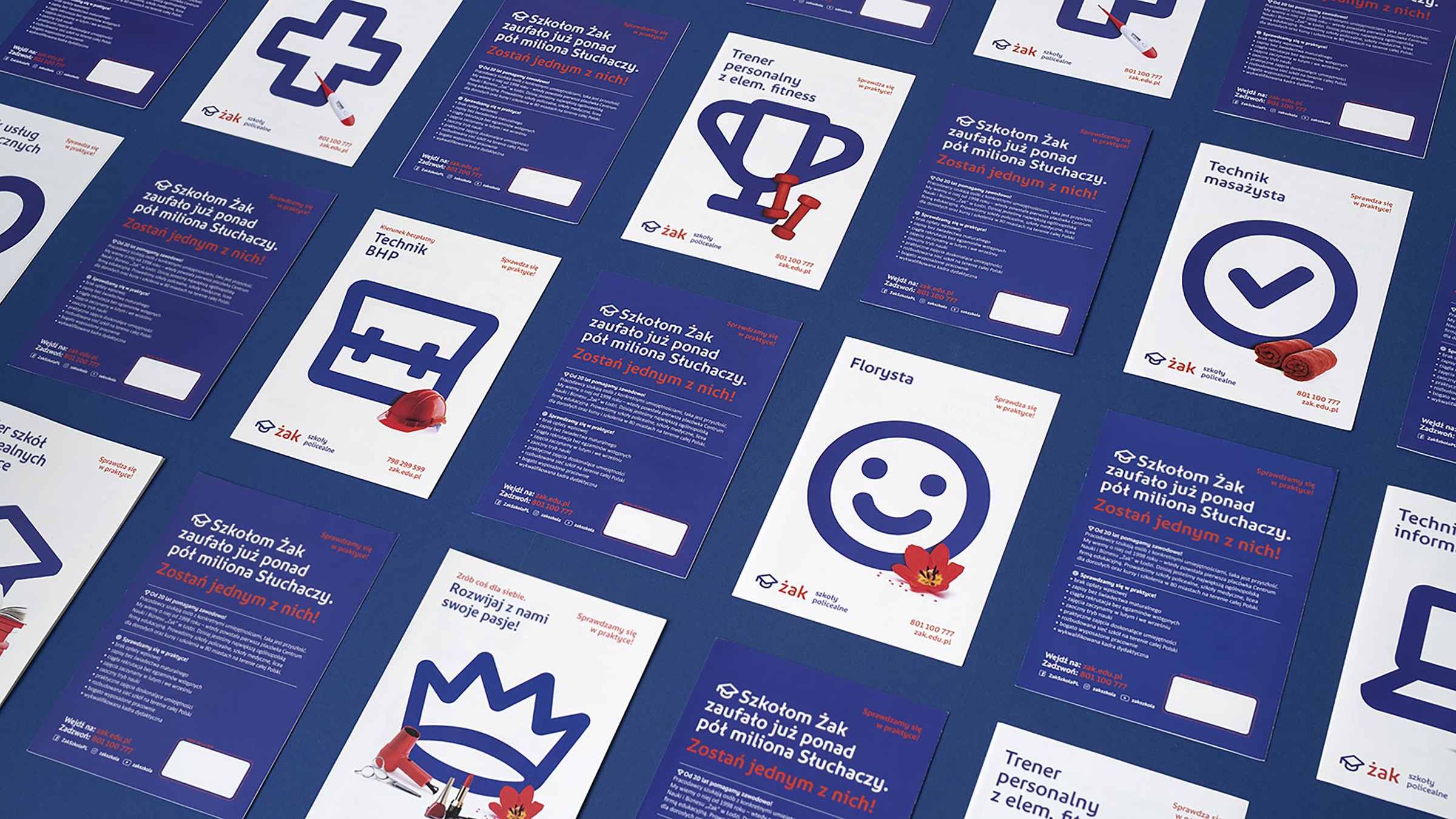
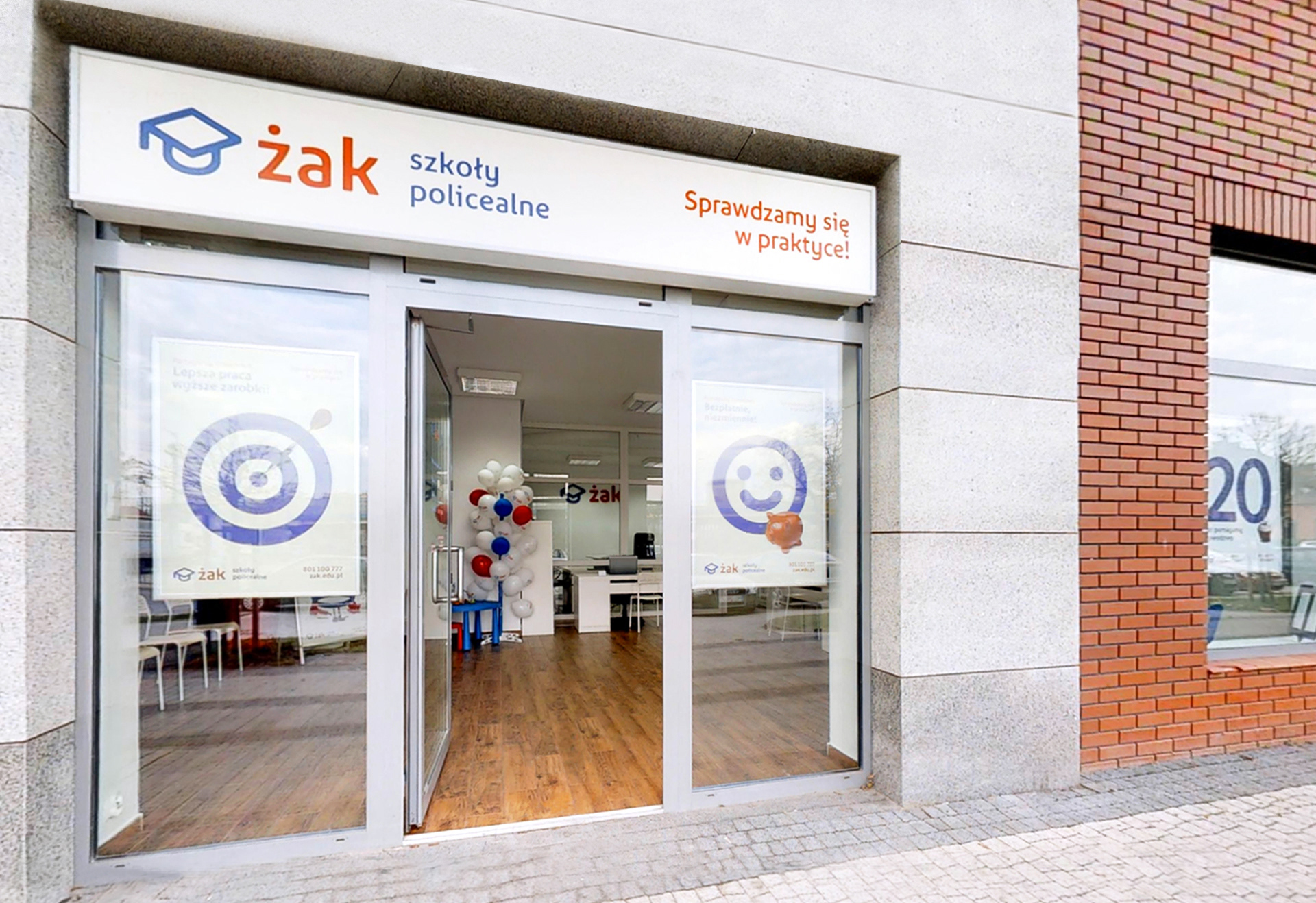
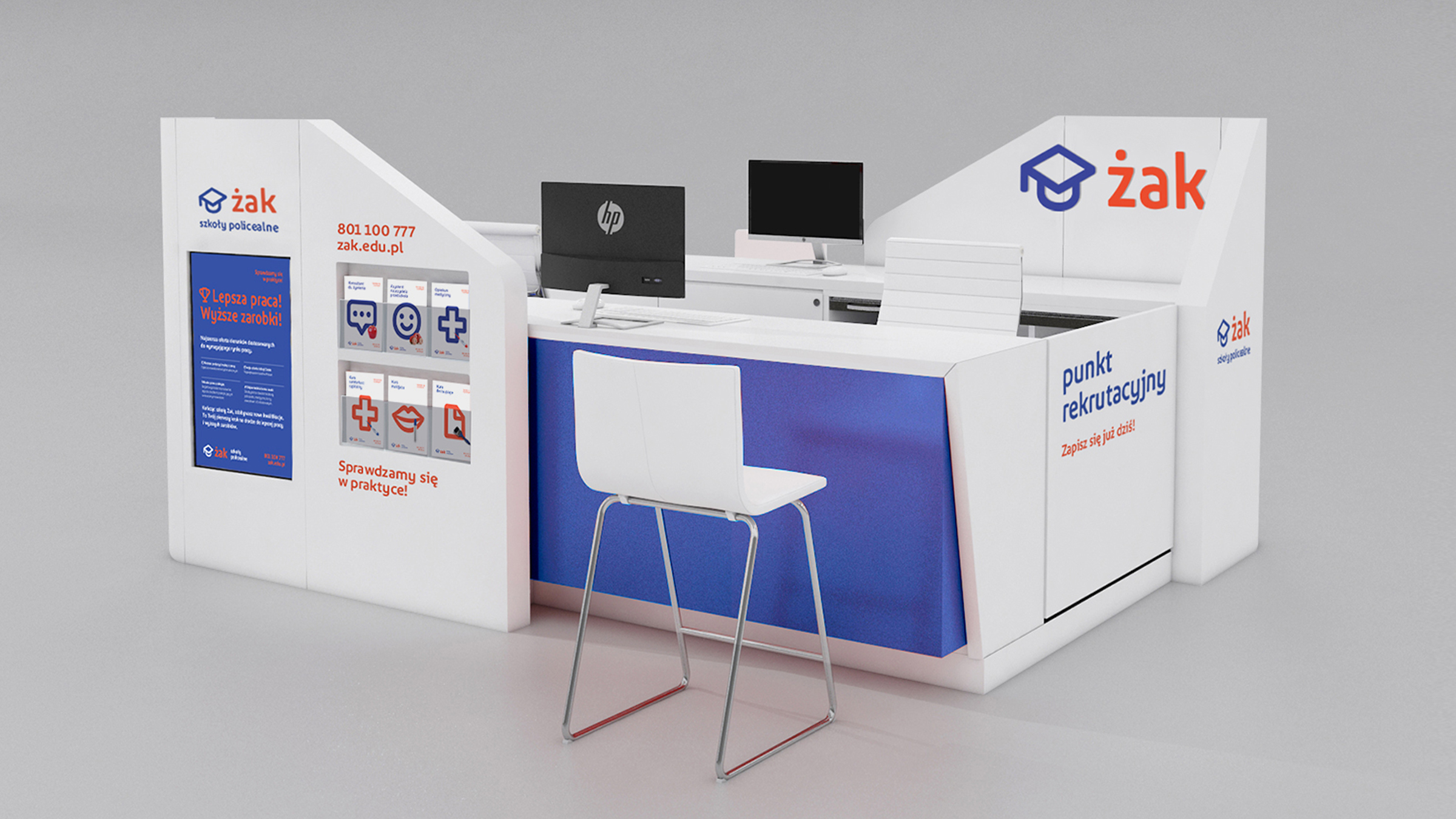
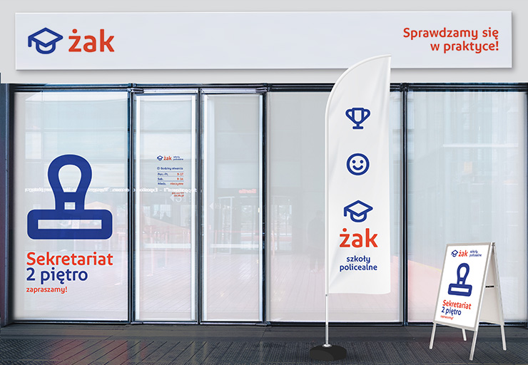
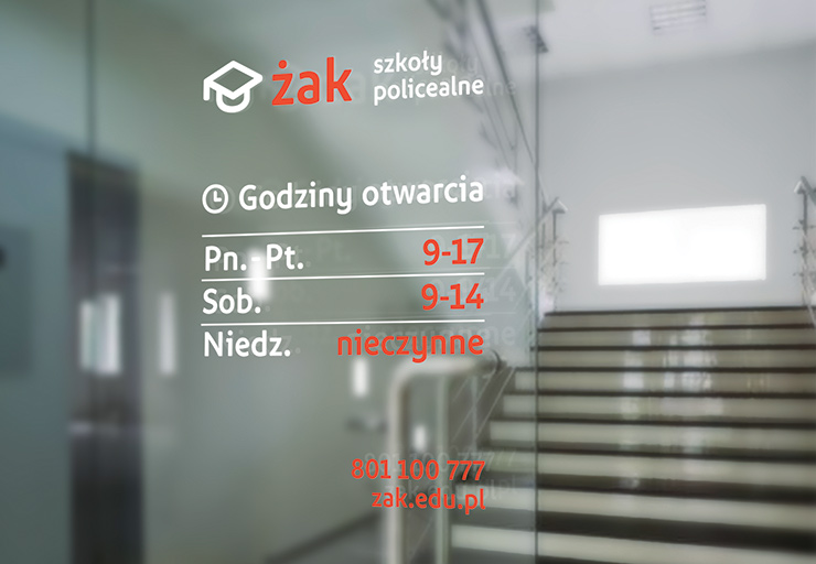
The standardisation solutions proposed by PBD have become a key element in creating the graphic image of the organisation and the ŻAK brand. I am satisfied with the solutions worked out, which give coherence to the graphic materials, Internet activities and signage of the secretariats. I evaluate the quality of communication with the agency very well.

Witold Dudaczyk
Chairman of the Board
Następny projekt
Ancymondo
A colourful world for all Ancymons

Koszyk

Zamknij