Piotr Trzeźwiński
Communication & Marketing Manager
Nationwide initiative dedicated to seniors
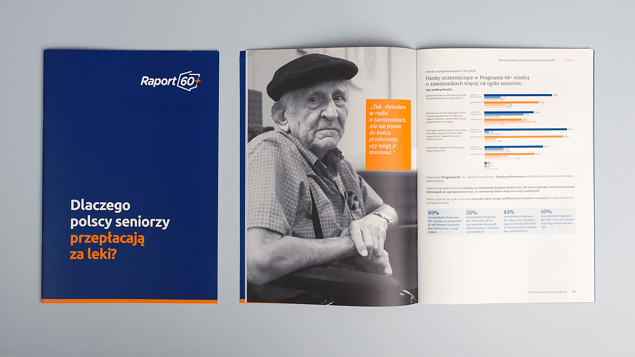
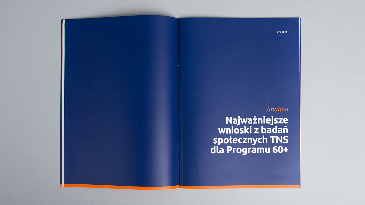
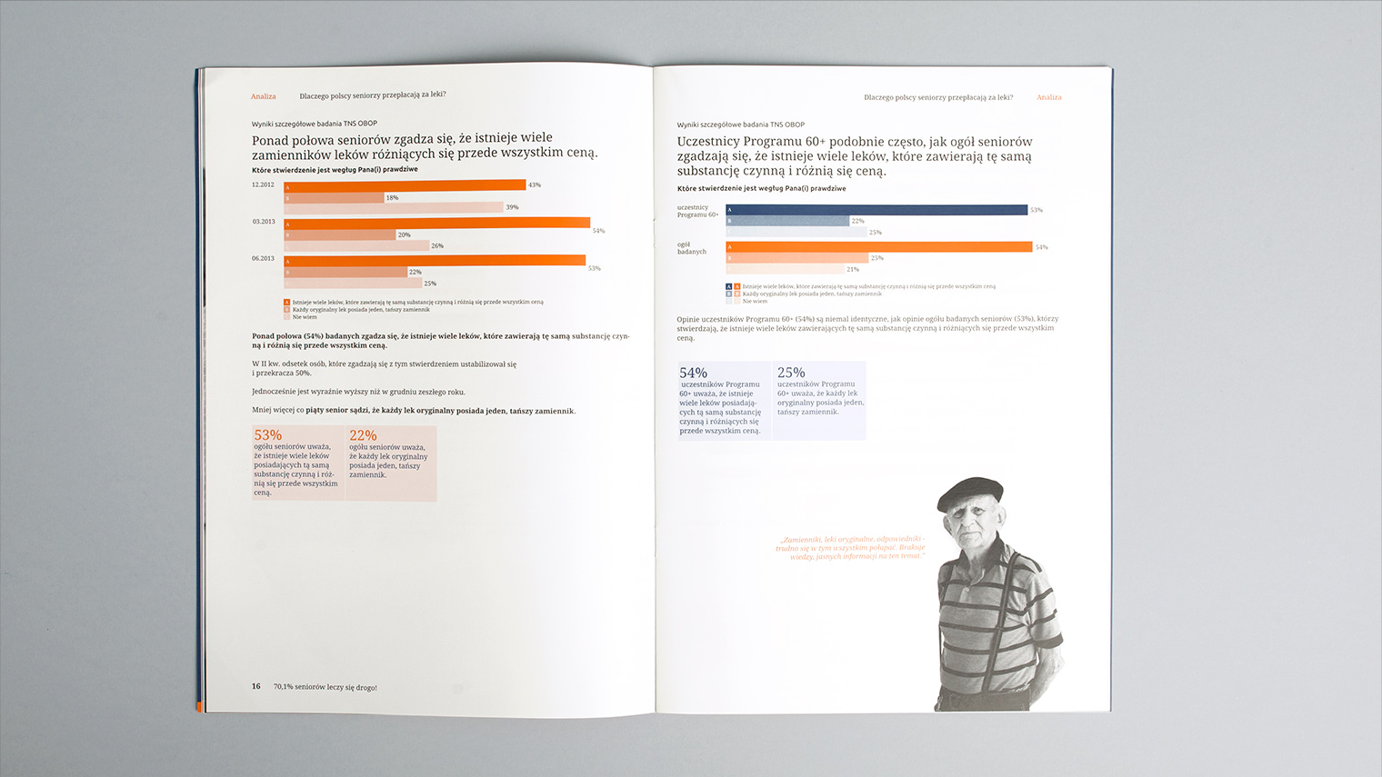
Over the years, the 60+ brand has evolved into a nationwide initiative to support the elderly, involving doctors, pharmacists and pharmaceutical companies.
The decision to refresh the visual identity system came in the wake of a repositioning and expansion of the brand’s market activities. Work on the brand’s visual identity was preceded by research into older people’s perceptions of the world.
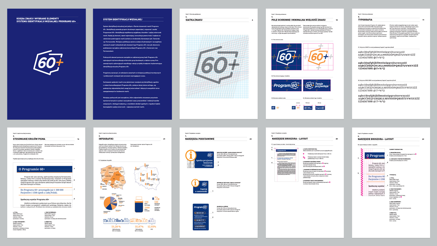
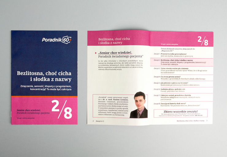
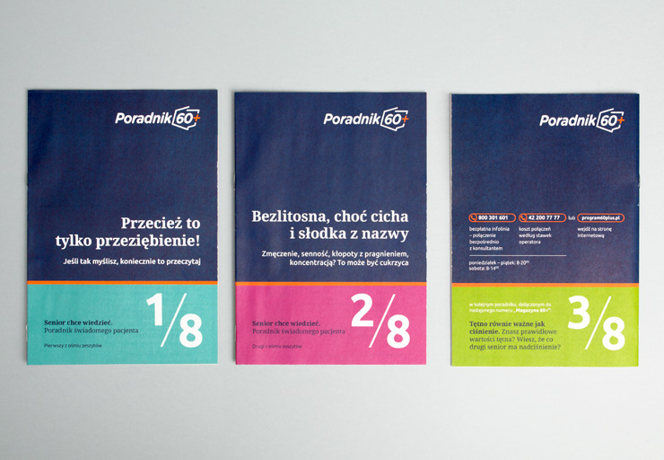
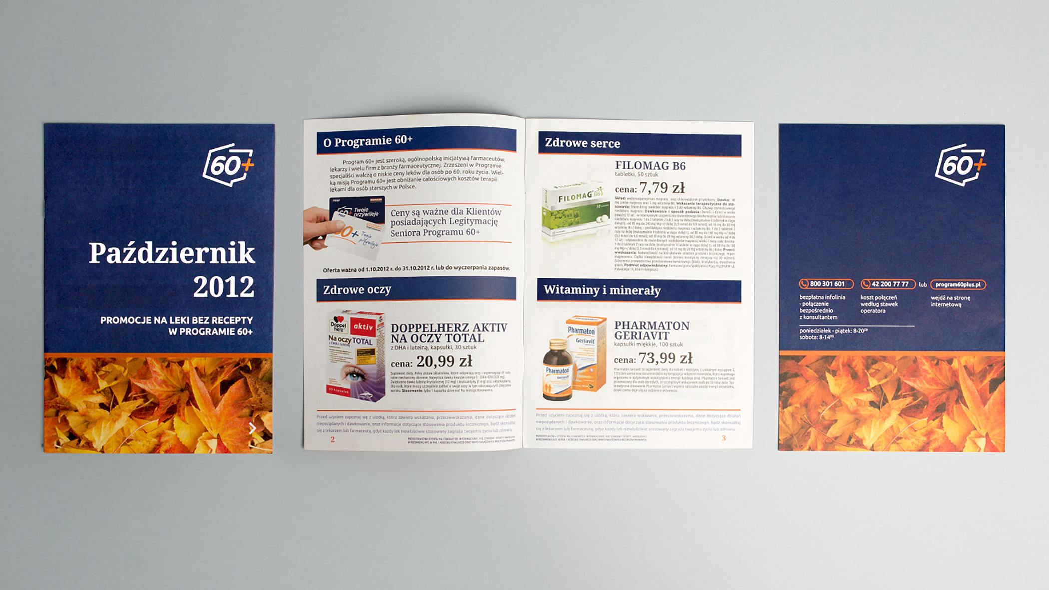
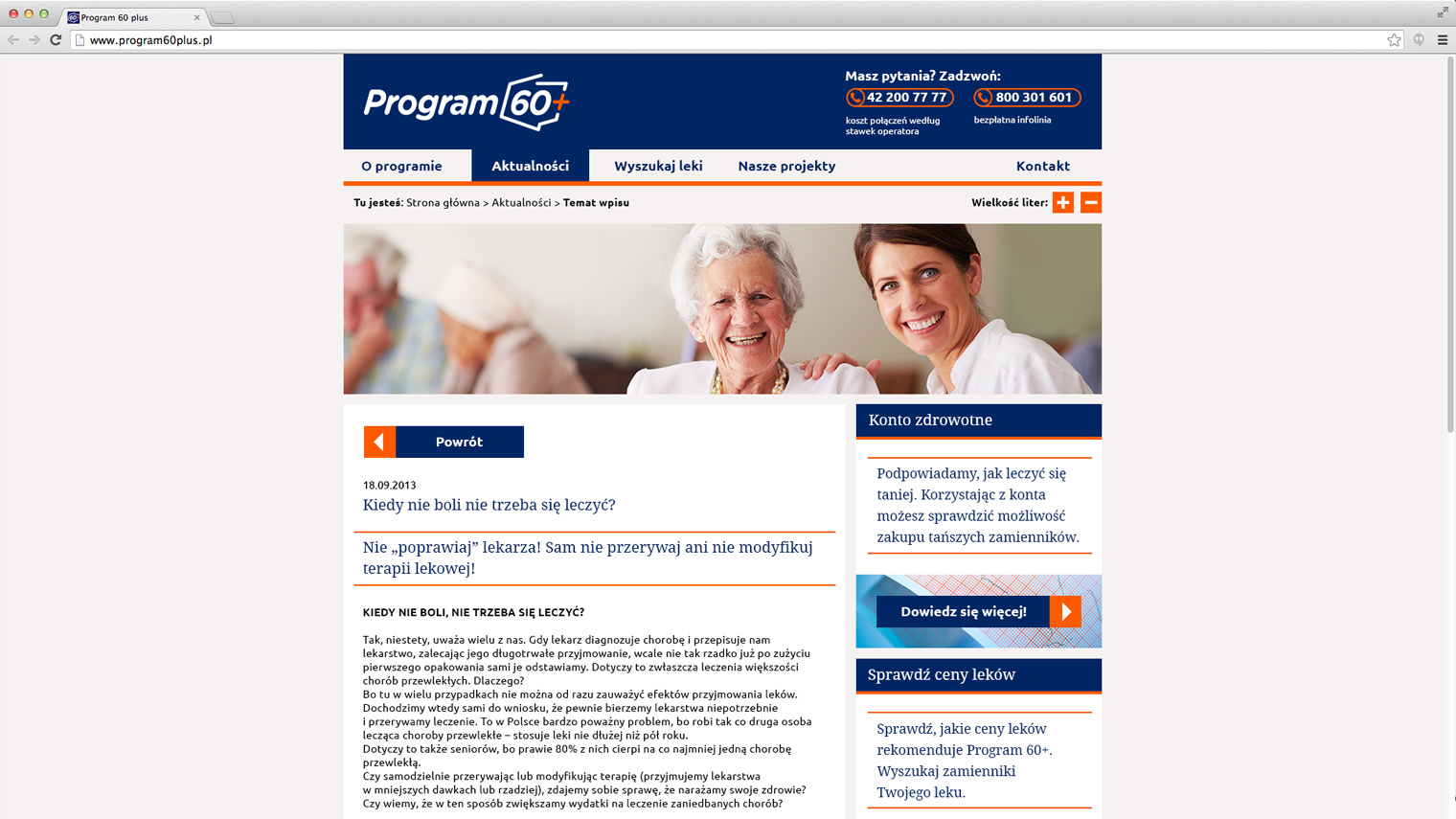
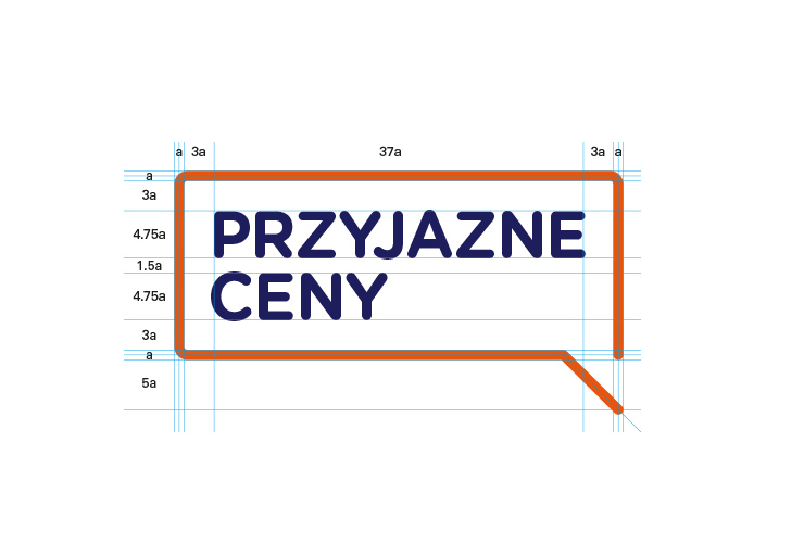
Taking into account the results of research in the field of gerontology and geriatrics, in particular dysfunctional perceptual processes, an optimal solution was developed to facilitate contact with the 60+ for older people: appropriate typefaces and their colours, text structure and communication style, key visuals corresponding to the needs of the age group. All marketing materials for the brand are now designed with older people in mind (choice of information, composition, colour scheme, choice of typeface and size of letters).

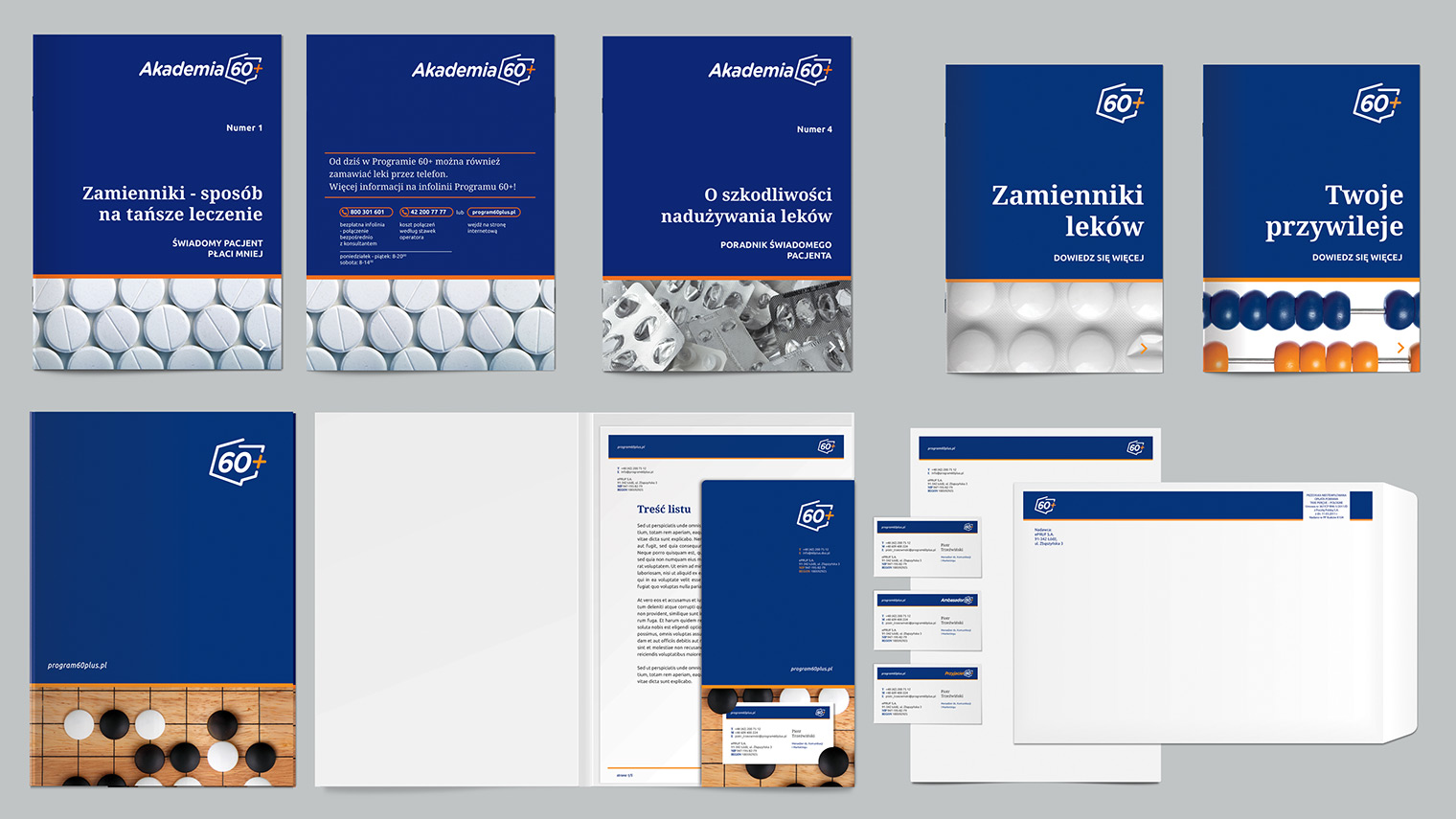
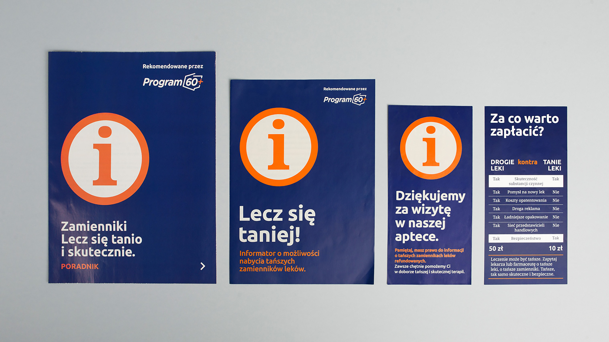

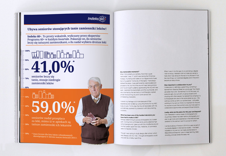


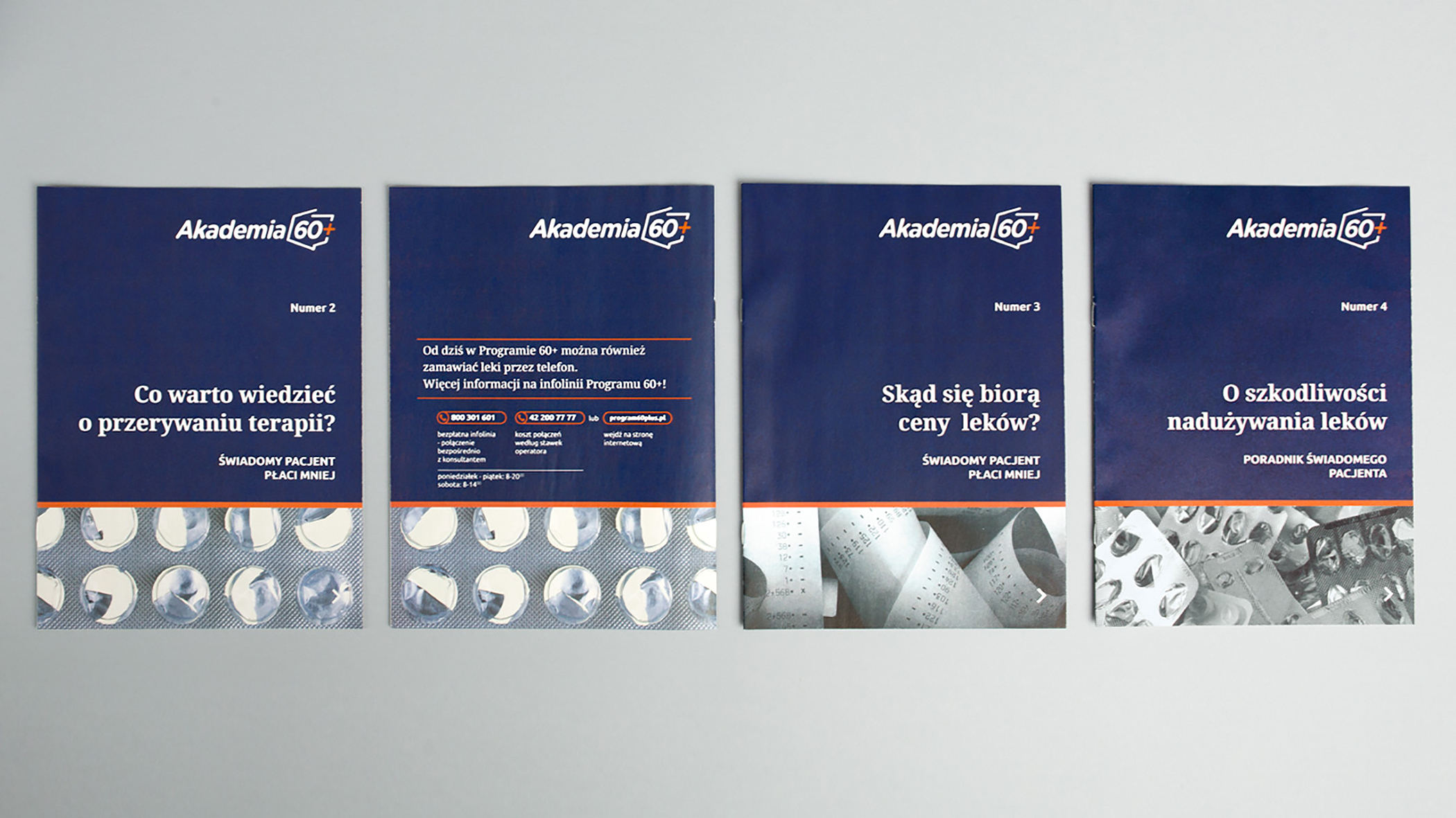
For the Programme, we have developed a number of information booklets on the correct use and delivery of drug therapies.

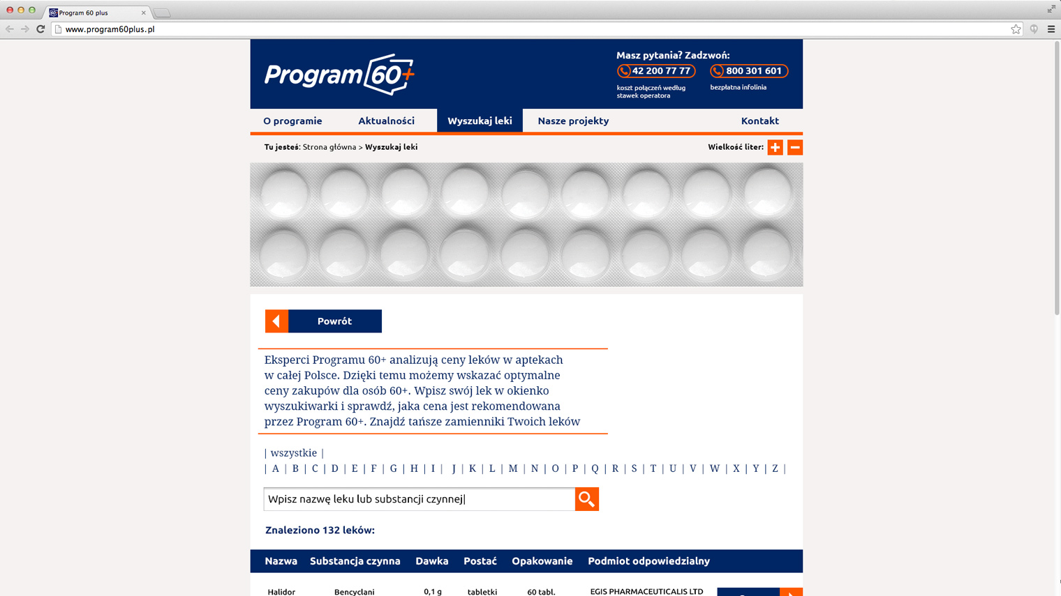
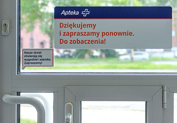
Another stage in the expansion of the 60+ Programme was the unprecedented project of a pharmacy dedicated to seniors and the first such branch of the DOZ pharmacy chain. The branch is distinguished above all by ergonomic solutions adapted to serving seniors, as well as communication appropriate for this group.

Here, seniors will receive information on the medication they are taking and the possibility of using substitutes. We have provided space for a seated service point for the disabled, as well as pharmaceutical care points.
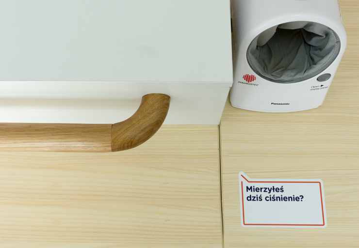
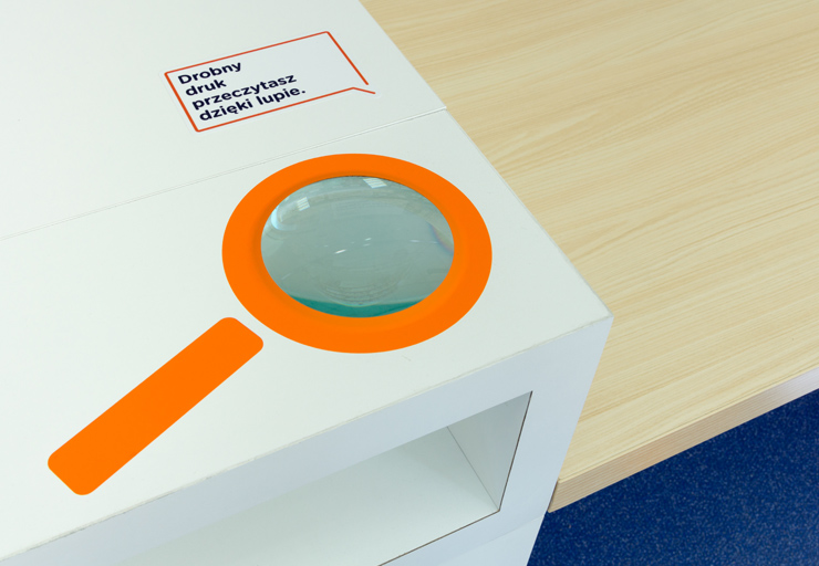
Anti-slip floors, previously used in hospitals, have been laid in pharmacies. At the counters, there are wooden handrails and places for bags so that seniors can at least rest for a while while standing in line. Chairs have been placed at the counters, where patients can sit while the pharmacist processes their prescriptions. The visual identity system also responds to the perceptual dysfunctions that come with age: the typeface, colours and illustrative style have been chosen to make reading easier for older patients.




References