Marcin Dudek
Member of the Board
Leader in fall protection systems
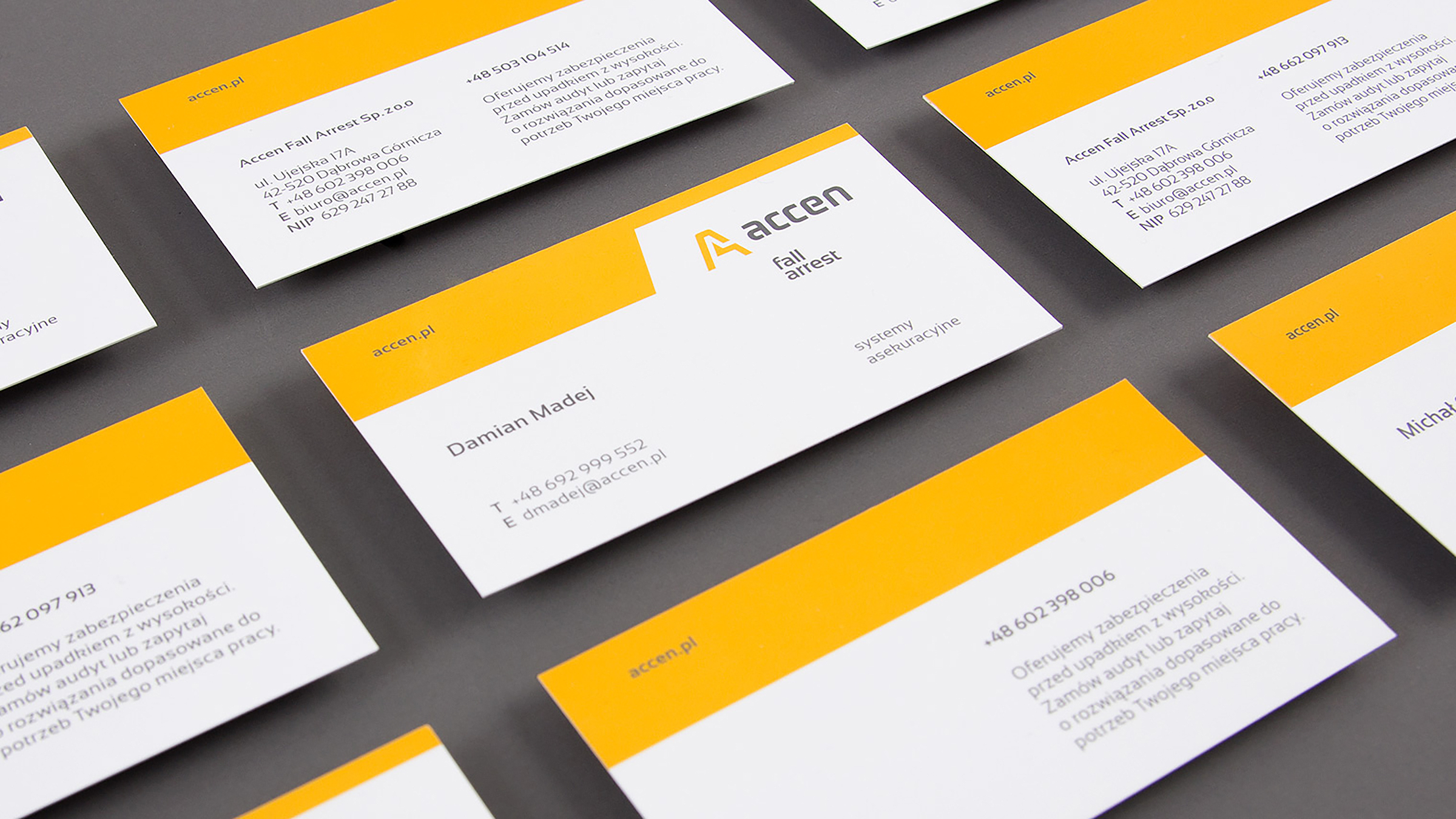
The second national manufacturer in the field of fall protection systems. The company develops and implements projects throughout Europe.
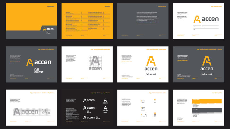
The brand needed a new visual identity that emphasised the technical nature of the company, while revealing the strength of the design department’s services, offering solutions for construction and industry.
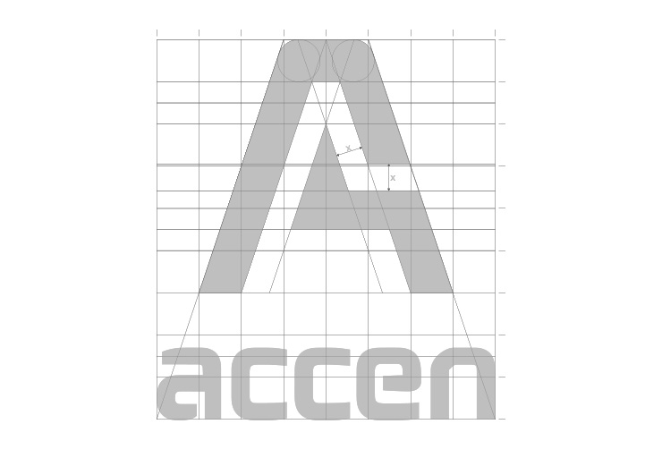
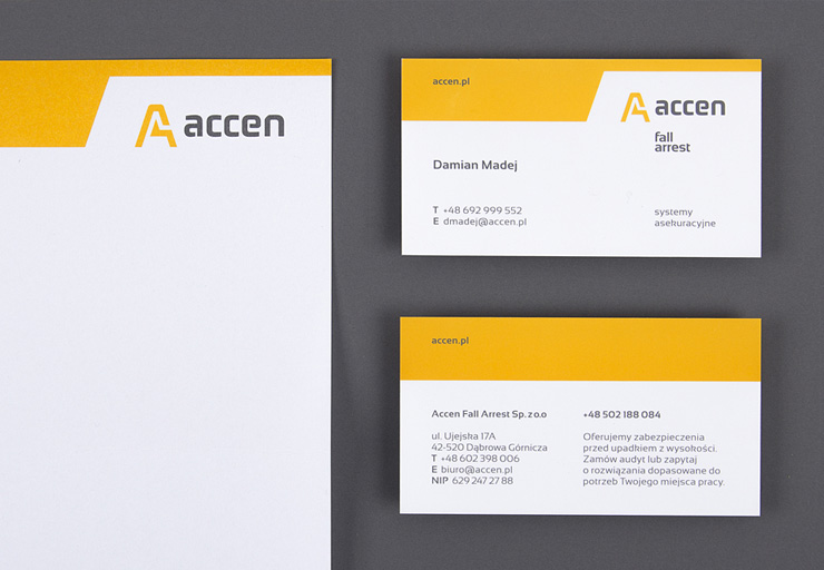
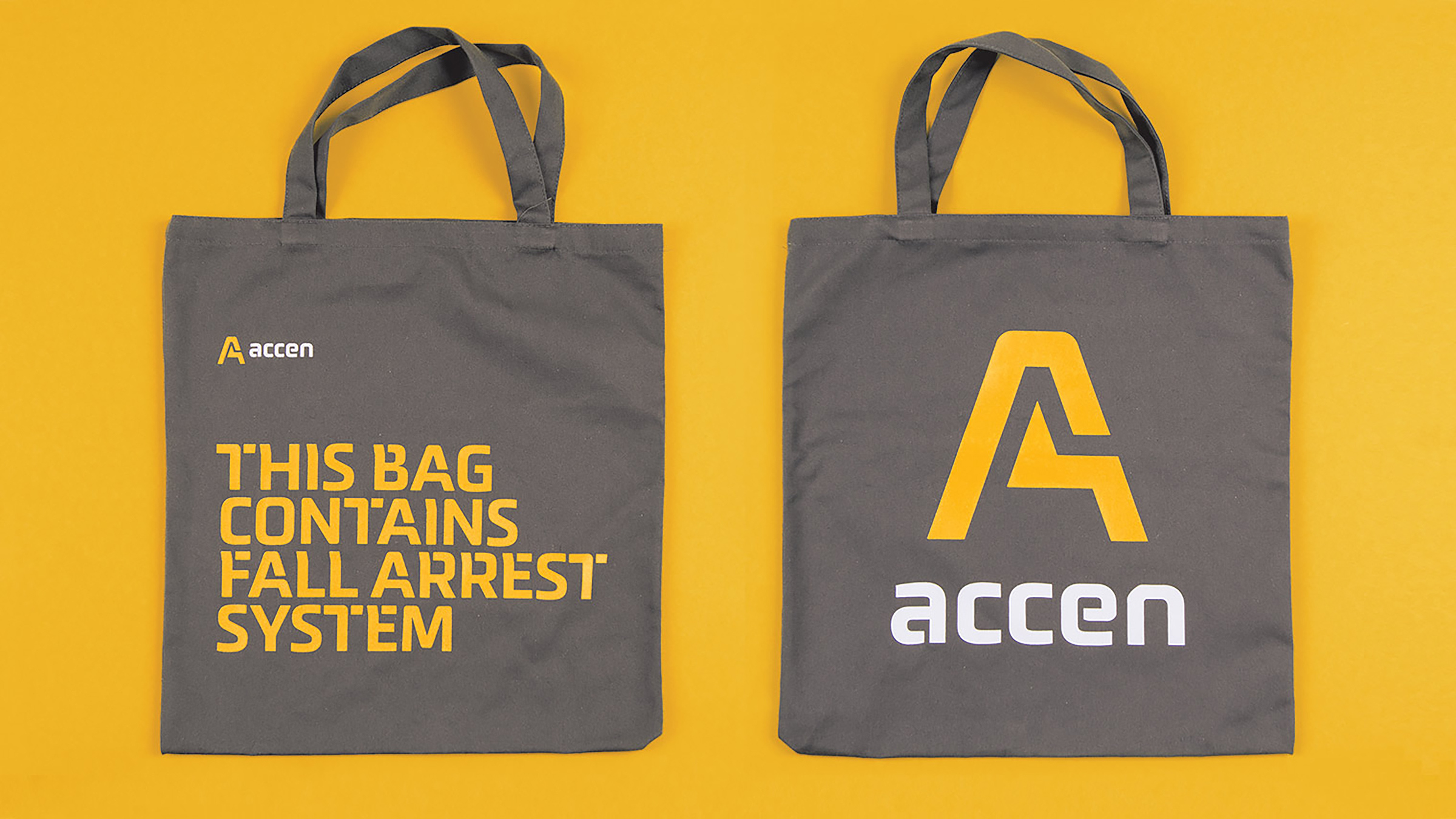
The new signet metaphorically encapsulates the “essence” of ACCEN’s services. Through the symbol of a clasp, a latch, we communicate the guarantee of security which the person using the company’s products and services gains. The “accen” logotype has been improved and refined typographically, at the same time referring to the previously used logo. The colours are subdued, with a predominance of deep graphite and warm yellow as colours conventionally present in the workplace safety industry.
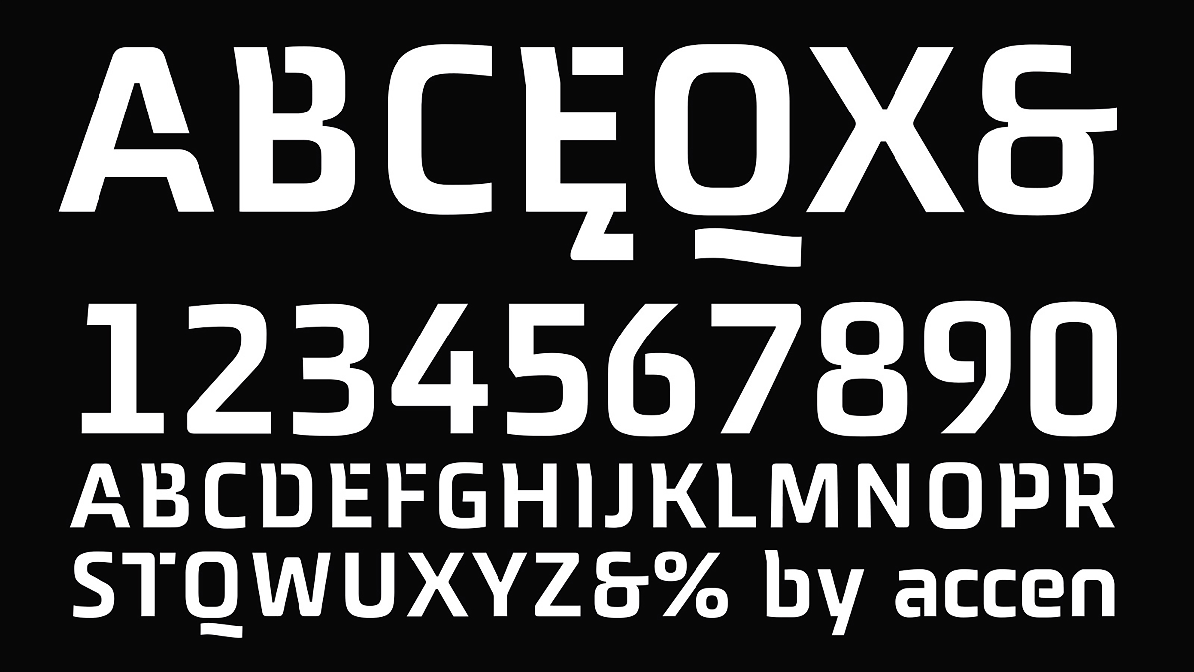
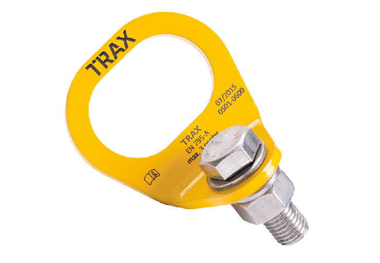
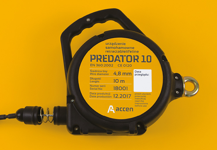
In response to the task set before us of developing a way to brand all product brands with a common umbrella, the corporate font was created.
The dedicated typeface used in the naming of the systems allows the product lines to develop independently, while leaving no doubt that each belongs to the Accen range. The typeface has a robust and distinctive character. The typeface has been designed in a single thickness. The design of the letters is simplified, and the arcs are short and broken – the typeface refers to the technical nature of Accen’s business.
The refined details and the introduced character of stencilling add to the expressiveness. The vertical lines of the letters such as B, H, E and R, among others, have been shaped in such a way as to break up the uniform character of the large number of vertical and horizontal elements in the verso, while maintaining a solid structure.
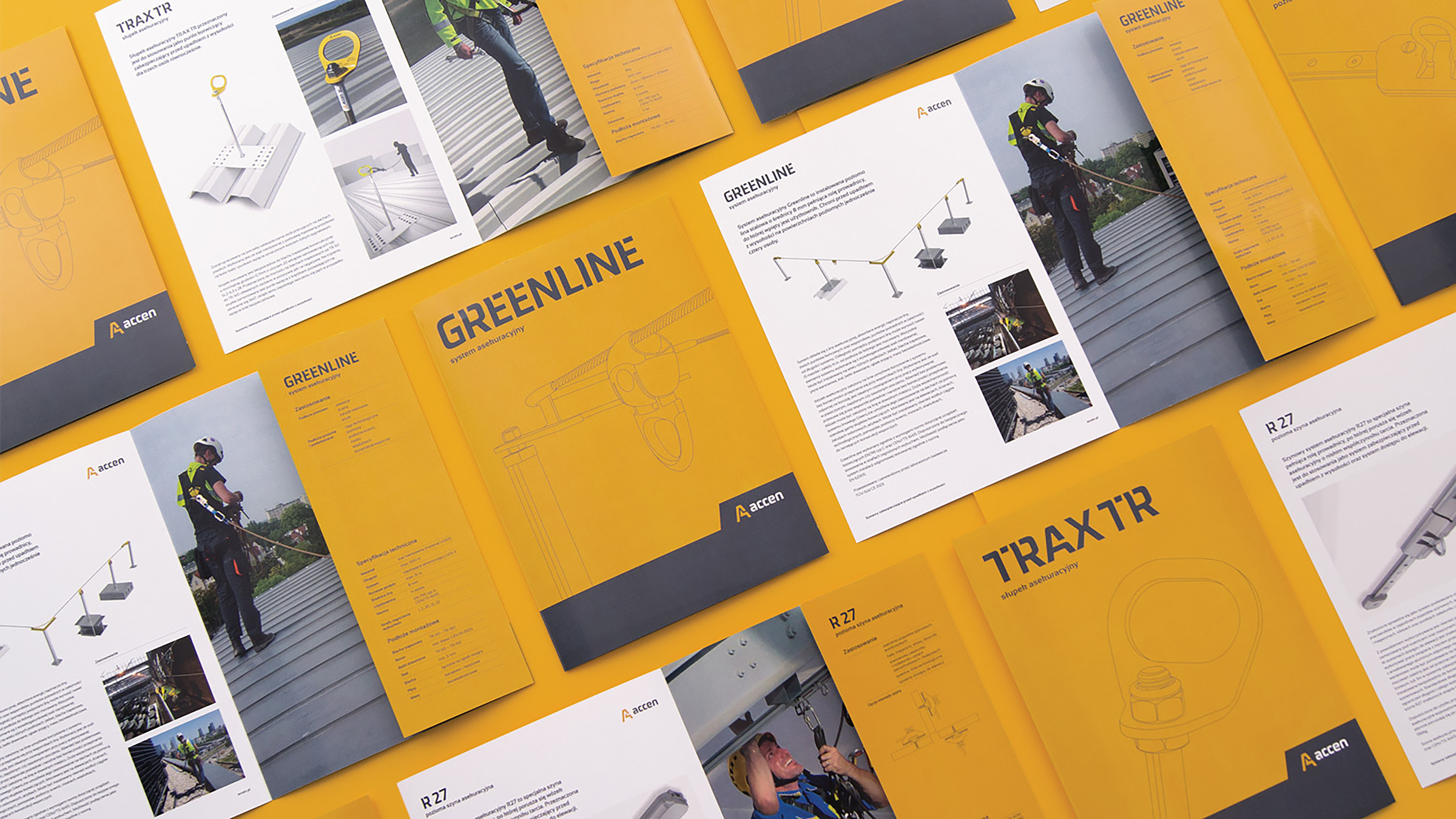
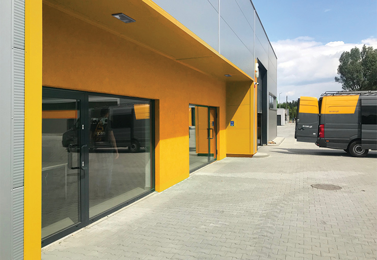
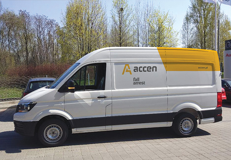
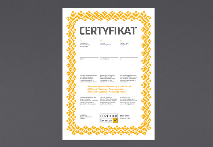
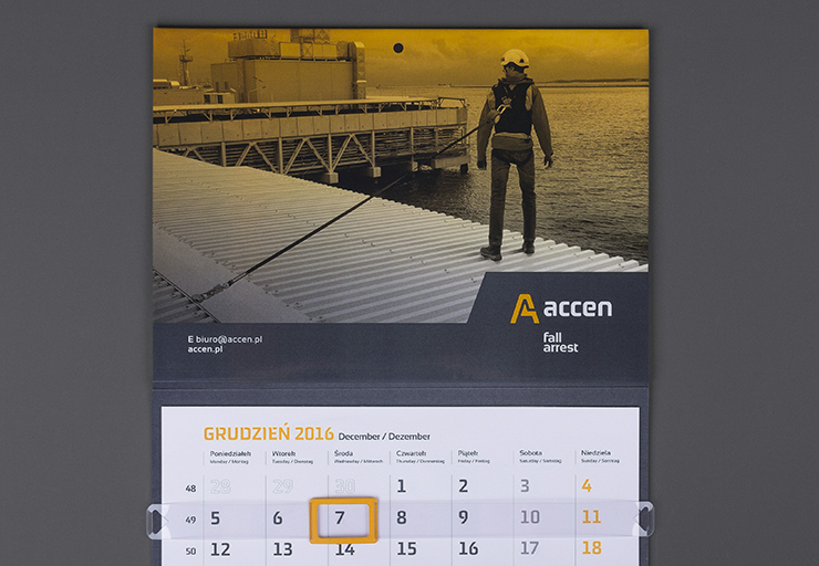
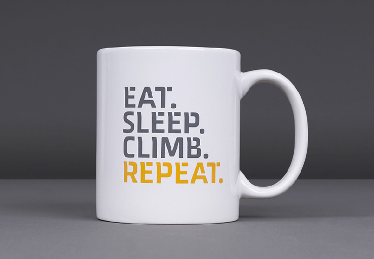
Accen’s visual identity system also extends to promotional and advertising materials with our help.
References